what is the best way to improve the clarity of this data?\na) add labels\nb) make concise\nc) reorganize\nd)…
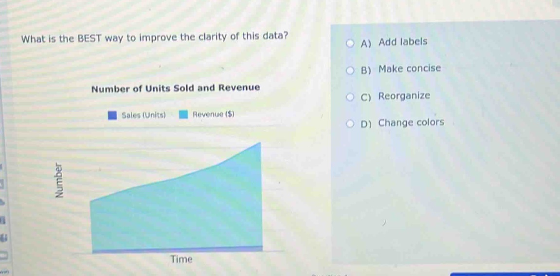
what is the best way to improve the clarity of this data?\na) add labels\nb) make concise\nc) reorganize\nd) change colors\nnumber of units sold and revenue\nsales (units) revenue ($)\nnumber\ntime
Answer
Brief Explanations:
The graph has no labels on the axes for the numerical values (e.g., no indication of what specific numbers the "Number" axis represents in terms of units or revenue amounts). Adding labels would make it clear what the scale of the "Number" axis corresponds to (e.g., if each mark is 10 units for sales or $100 for revenue). Making concise (B) isn't relevant as the main issue is lack of clarity in what the "Number" represents. Reorganizing (C) or changing colors (D) won't address the fundamental lack of information about the numerical scale.
Answer:
A. Add labels