a cell phone company charges by the minute (and partial minute) for making phone calls. arionnas plan…
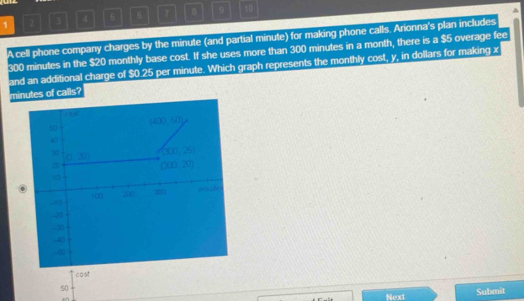
a cell phone company charges by the minute (and partial minute) for making phone calls. arionnas plan includes 300 minutes in the $20 monthly base cost. if she uses more than 300 minutes in a month, there is a $5 overage fee and an additional charge of $0.25 per minute. which graph represents the monthly cost, y, in dollars for making x minutes of calls?
Answer
Explanation:
Step1: Analyze cost for $x\leq300$
For $x\leq300$ minutes, the monthly cost $y = 20$ (a flat - rate of the base cost). So, the graph is a horizontal line at $y = 20$ for $0\leq x\leq300$.
Step2: Analyze cost for $x > 300$
The base cost is $20$, the over - age fee is $5$, and the additional charge is $0.25$ per minute for $x>300$. The cost function for $x > 300$ is $y=20 + 5+0.25(x - 300)=25+0.25x-75=0.25x - 50$. When $x = 400$, $y=0.25\times400-50=100 - 50=50$.
Answer:
The graph that has a horizontal line at $y = 20$ for $0\leq x\leq300$ and then a line with a slope of $0.25$ starting at the point $(300,25)$ and passing through the point $(400,50)$ is the correct graph.