charles owns a catering business. the amount his 10 most recent clients spent is shown in the histogram…
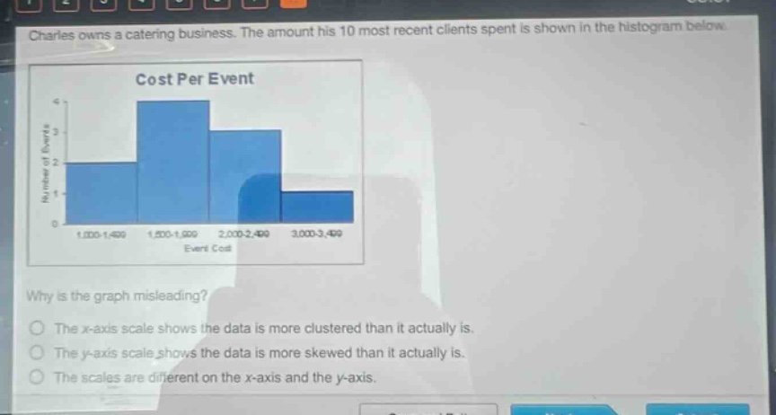
charles owns a catering business. the amount his 10 most recent clients spent is shown in the histogram below. cost per event why is the graph misleading? the x - axis scale shows the data is more clustered than it actually is. the y - axis scale shows the data is more skewed than it actually is. the scales are different on the x - axis and the y - axis.
Answer
Brief Explanations:
The y - axis scale has intervals that make the data seem more skewed than it actually is. For example, the jump from 0 - 1 on the y - axis is much larger visually compared to the other intervals, distorting the perception of the data distribution.
Answer:
The y - axis scale shows the data is more skewed than it actually is.