charles owns a catering business. the amount his 10 most recent clients spent is shown in the histogram…
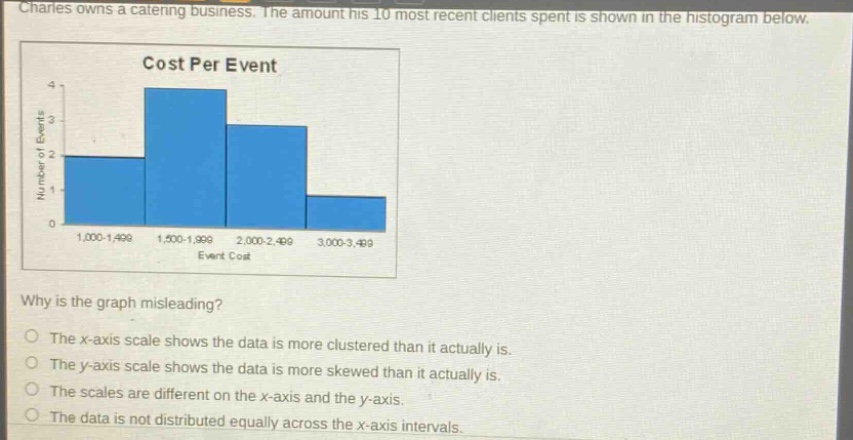
charles owns a catering business. the amount his 10 most recent clients spent is shown in the histogram below. cost per event why is the graph misleading? the x - axis scale shows the data is more clustered than it actually is. the y - axis scale shows the data is more skewed than it actually is. the scales are different on the x - axis and the y - axis. the data is not distributed equally across the x - axis intervals.
Answer
Brief Explanations:
The y - axis starts at 0 but has an increment of 1, and the x - axis has unequal intervals (500 for first three and 400 for the last). This makes the data seem more clustered on the x - axis than it might be in reality. The x - axis scale gives a false impression of data clustering.
Answer:
The x - axis scale shows the data is more clustered than it actually is.