the graph shows some departments in a company and their percentage of the company’s total revenue. explain…
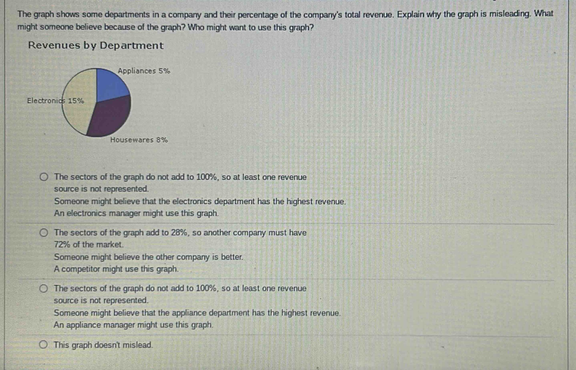
the graph shows some departments in a company and their percentage of the company’s total revenue. explain why the graph is misleading. what might someone believe because of the graph? who might want to use this graph? revenues by department appliances 5% electronics 15% housewares 8% the sectors of the graph do not add to 100%, so at least one revenue source is not represented. someone might believe that the electronics department has the highest revenue. an electronics manager might use this graph. the sectors of the graph add to 28%, so another company must have 72% of the market. someone might believe the other company is better. a competitor might use this graph. the sectors of the graph do not add to 100%, so at least one revenue source is not represented. someone might believe that the appliance department has the highest revenue. an appliance manager might use this graph. this graph doesn’t mislead.
Answer
Brief Explanations:
A pie - chart should represent all parts of a whole, summing up to 100%. Here, 5% (Appliances)+15% (Electronics)+8% (Housewares)=28%, which means other revenue sources are not shown. Someone might wrongly assume the electronics department has the highest revenue as it has the largest slice among the shown ones. An electronics manager might use this to over - emphasize their department's importance.
Answer:
The sectors of the graph do not add to 100%, so at least one revenue source is not represented. Someone might believe that the electronics department has the highest revenue. An electronics manager might use this graph.