james, a business manager, wants to create a visual showing the percentage of employees in each department…
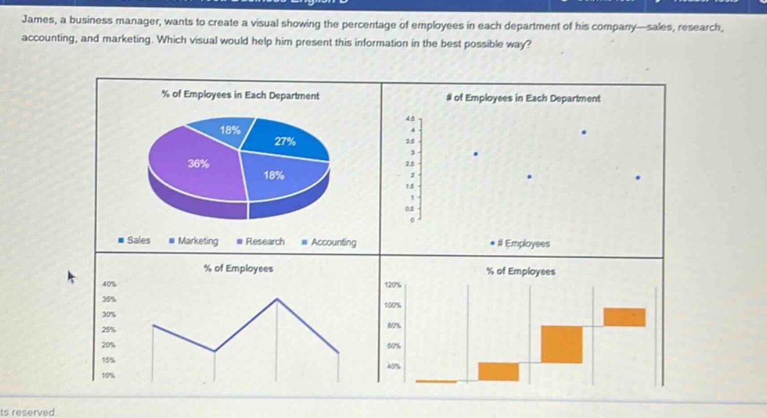
james, a business manager, wants to create a visual showing the percentage of employees in each department of his company—sales, research, accounting, and marketing. which visual would help him present this information in the best possible way?
Answer
Brief Explanations:
A pie chart (the top - left visual) is ideal for showing proportions or percentages of a whole. Since James wants to present the percentage of employees in each department (which together make up the whole company's workforce), a pie chart effectively conveys what portion each department (sales, research, accounting, marketing) represents of the total. The scatter plot (top - right) is for showing the relationship between two variables (here it shows the number of employees in an unclear context). The line graph (bottom - left) is better for showing trends over time. The box - and - whisker plot (bottom - right) is used to show the distribution of data, not the proportion of parts to a whole.
Answer:
The pie chart (the visual labeled “% of Employees in Each Department” with segments for Sales, Marketing, Research, and Accounting).