in order to set a staff schedule, a fast - food restaurant manager looks at the average rate of customers…
in order to set a staff schedule, a fast - food restaurant manager looks at the average rate of customers served per minute during a lunch service. the manager notices that the time period starts with a sharp but steady increase, is followed by a period during which the restaurant is constantly serving the maximum number of customers per minute, and then has a slow but steady decline. which graph models the trend the manager notices?
Answer
Explanation:
Step1: Analyze initial sharp increase.
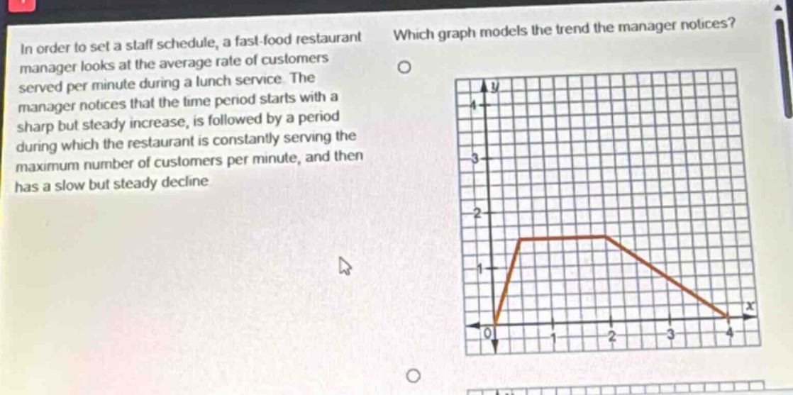
The trend description states it "starts with a sharp but steady increase". The first segment of the provided graph, from coordinates (0,0) to approximately (0.5, 1.5), shows a steep positive slope. The slope $m_1$ is calculated as: $$m_1 = \frac{1.5 - 0}{0.5 - 0} = \frac{1.5}{0.5} = 3$$ This positive slope represents a sharp, steady increase in the rate of customers served.
Step2: Analyze maximum service period.
The description continues with "a period during which the restaurant is constantly serving the maximum number of customers per minute". The second segment of the graph, from approximately (0.5, 1.5) to (2, 1.5), is a horizontal line. A horizontal line indicates a constant rate, which in this context is the maximum rate of 1.5 customers per minute.
Step3: Analyze slow steady decline.
Finally, the trend "has a slow but steady decline". The third segment of the graph, from (2, 1.5) to (4, 0), shows a negative slope, indicating a decline. The slope $m_2$ is calculated as: $$m_2 = \frac{0 - 1.5}{4 - 2} = \frac{-1.5}{2} = -0.75$$ This negative slope represents a steady decline.
Step4: Compare increase and decline rates.
The description specifies a "sharp" increase and a "slow" decline. Comparing the magnitudes of the slopes: the absolute slope of the decline is $|m_2| = |-0.75| = 0.75$. The slope of the increase is $m_1 = 3$. Since $0.75 < 3$, the rate of decline is indeed slower than the rate of increase.
Step5: Conclude graph suitability.
The provided graph accurately models all three phases of the trend: a sharp initial increase, a period of serving customers at a maximum constant rate, and a subsequent slow, steady decline. Therefore, this graph correctly represents the trend noticed by the manager.
Answer:
O. The graph that starts at the origin (0,0), increases with a steep slope to a rate of 1.5 customers/minute, maintains this rate for a period, and then decreases with a gentler slope to 0 customers/minute.