select the correct answer from each drop - down menu. the graphs below show the number of faulty products…
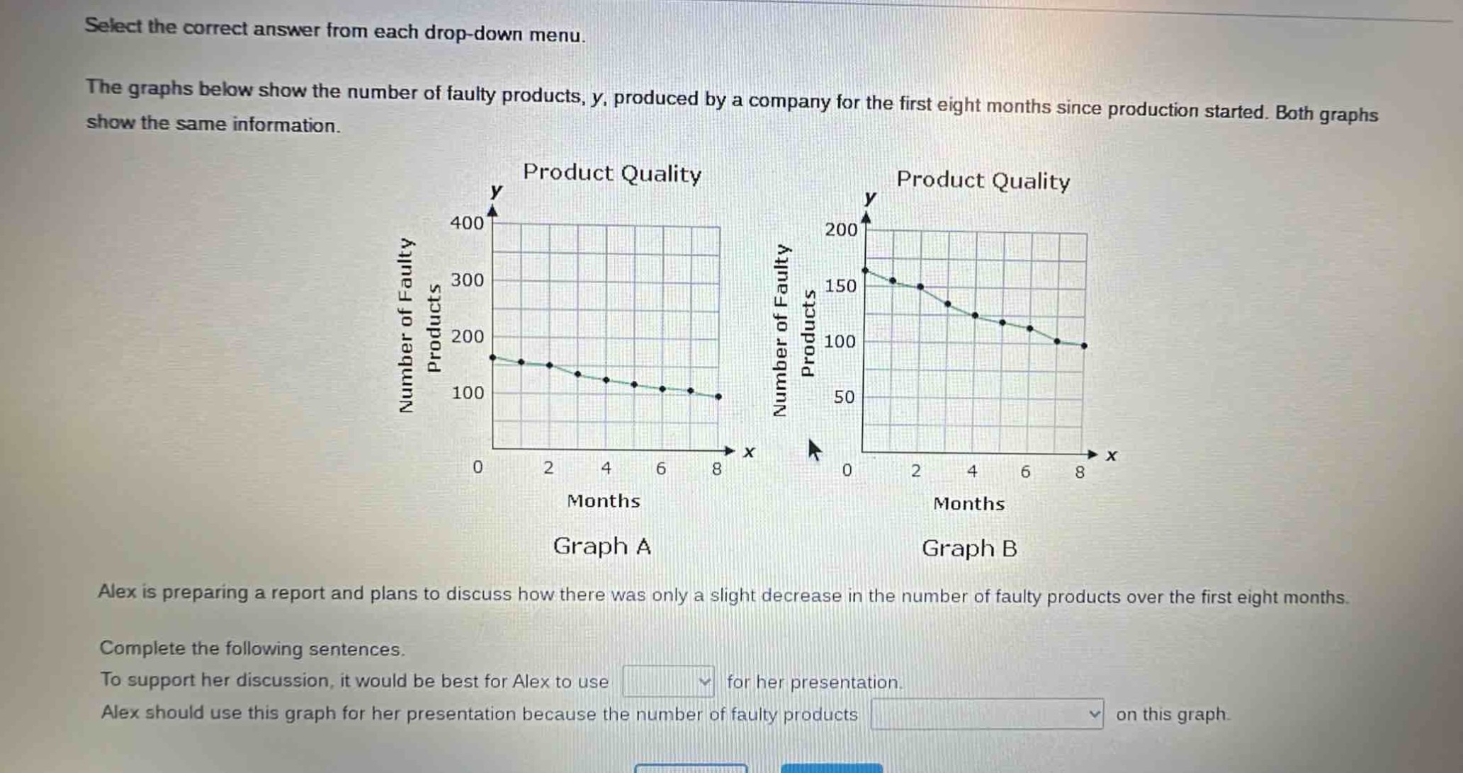
select the correct answer from each drop - down menu. the graphs below show the number of faulty products, y, produced by a company for the first eight months since production started. both graphs show the same information. alex is preparing a report and plans to discuss how there was only a slight decrease in the number of faulty products over the first eight months. complete the following sentences. to support her discussion, it would be best for alex to use drop - down for her presentation. alex should use this graph for her presentation because the number of faulty products drop - down on this graph.
Answer
Explanation:
Step1: Analyze visual impact of graphs
Graph A has a larger y - axis range (0 - 400) and Graph B has a smaller y - axis range (0 - 200). When the y - axis range is larger, the same decrease in the number of faulty products will appear less steep.
Step2: Determine graph for the claim
Since Alex wants to show a slight decrease, she should use Graph A as the decrease will seem less significant visually due to the larger y - axis scale.
Answer:
To support her discussion, it would be best for Alex to use Graph A for her presentation. Alex should use this graph for her presentation because the number of faulty products appears to decrease less steeply on this graph.