you need to create a graphic that will allow management to know if representatives hit target percentages…
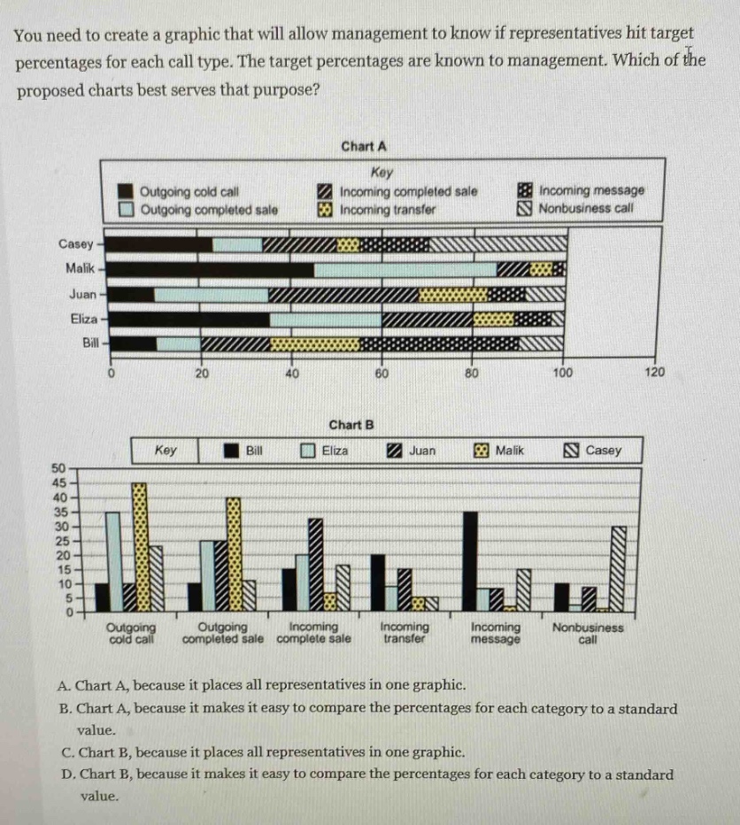
you need to create a graphic that will allow management to know if representatives hit target percentages for each call type. the target percentages are known to management. which of the proposed charts best serves that purpose? chart a key outgoing cold call incoming completed sale incoming message outgoing completed sale incoming transfer nonbusiness call casey malik juan eliza bill 0 20 40 60 80 100 120 chart b key bill eliza juan malik casey 50 45 40 35 30 25 20 15 10 5 0 outgoing cold call outgoing completed sale incoming complete sale incoming transfer incoming message nonbusiness call a. chart a, because it places all representatives in one graphic. b. chart a, because it makes it easy to compare the percentages for each category to a standard value. c. chart b, because it places all representatives in one graphic. d. chart b, because it makes it easy to compare the percentages for each category to a standard value.
Answer
Brief Explanations:
Chart A shows all representatives in one graph with different call - type segments for each representative. It is easier to compare the percentage of each call type for each representative against a standard value (the target percentage known to management) as all data for representatives is in one place. Chart B focuses more on comparing representatives for each call type rather than comparing to a standard value.
Answer:
B. Chart A, because it makes it easy to compare the percentages for each category to a standard value.