the bottom line on the graph shows the change in american workers average hourly wages from 1964 to 2018…
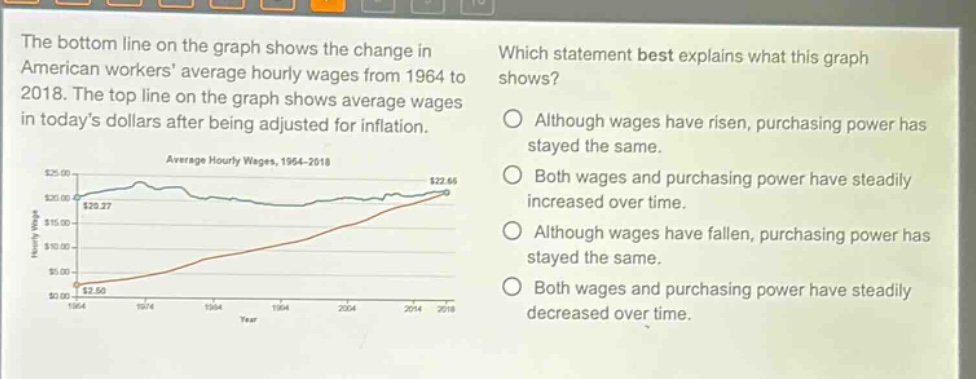
the bottom line on the graph shows the change in american workers average hourly wages from 1964 to 2018. the top line on the graph shows average wages in todays dollars after being adjusted for inflation. which statement best explains what this graph shows? although wages have risen, purchasing power has stayed the same. both wages and purchasing power have steadily increased over time. although wages have fallen, purchasing power has stayed the same. both wages and purchasing power have steadily decreased over time.
Answer
Answer:
A. Although wages have risen, purchasing power has stayed the same.
Brief Explanations:
The bottom - line shows wage increase, and the top - line (adjusted for inflation) shows relatively stable purchasing power.