the chart compares the price of graphic t - shirts to the quantity demanded. demand schedule price per…
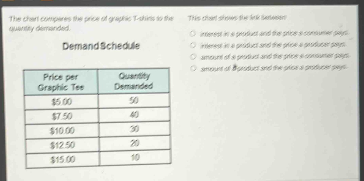
the chart compares the price of graphic t - shirts to the quantity demanded. demand schedule price per graphic tee quantity demanded $5.00 50 $7.50 40 $10.00 30 $12.50 20 $15.00 10 this chart shows the link between interest in a product and the price a consumer pays. interest in a product and the price a producer pays. amount of a product and the price a consumer pays. amount of a product and the price a producer pays.
Answer
Brief Explanations:
The demand schedule shows the relationship between the price of a product (graphic - tee) and the quantity demanded by consumers. As the price per graphic tee increases, the quantity demanded decreases. It represents the link between the amount of a product (quantity demanded) and the price a consumer pays.
Answer:
amount of a product and the price a consumer pays