estimated monthly salary\nhow might the graph be misleading?\nthe scale on the y - axis overemphasizes the…
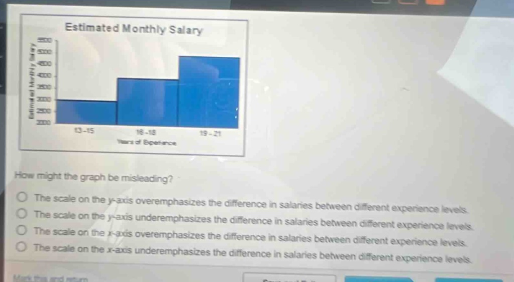
estimated monthly salary\nhow might the graph be misleading?\nthe scale on the y - axis overemphasizes the difference in salaries between different experience levels.\nthe scale on the y - axis underemphasizes the difference in salaries between different experience levels.\nthe scale on the x - axis overemphasizes the difference in salaries between different experience levels.\nthe scale on the x - axis underemphasizes the difference in salaries between different experience levels.
Answer
Brief Explanations:
The y - axis represents the estimated monthly salary. If the scale on the y - axis has a large increment or is not evenly spaced in a proper way, it can make the differences in salaries between different experience levels seem larger than they actually are. The x - axis represents years of experience and has no direct relation to over - or under - emphasizing salary differences.
Answer:
The scale on the y - axis overemphasizes the difference in salaries between different experience levels.