this graph compares consumer expenditures in three american cities from 2007 to 2010. average household…
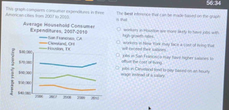
this graph compares consumer expenditures in three american cities from 2007 to 2010. average household consumer expenditures, 2007 - 2010 san francisco, ca cleveland, oh houston, tx the best inference that can be made based on the graph is that workers in houston are more likely to have jobs with high growth rates. workers in new york may face a cost of living that will exceed their salaries. jobs in san francisco may have higher salaries to offset the cost of living. jobs in cleveland tend to pay based on an hourly wage instead of a salary.
Answer
Brief Explanations:
The graph shows average household consumer expenditures in different cities. San Francisco has higher expenditures. Higher - cost living areas often have higher salaries to offset costs. The other options are not directly related to the information in the graph.
Answer:
jobs in San Francisco may have higher salaries to offset the cost of living.