the graph compares the cost of living in three different cities. which statement best explains this graph…
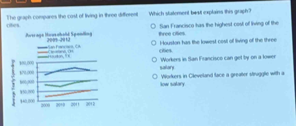
the graph compares the cost of living in three different cities. which statement best explains this graph? average household spending 2009 - 2012 san francisco, ca cleveland, oh houston, tx san francisco has the highest cost of living of the three cities. houston has the lowest cost of living of the three cities. workers in san francisco can get by on a lower salary. workers in cleveland face a greater struggle with a low salary.
Answer
Brief Explanations:
The graph shows average household spending from 2009 - 2012 for San Francisco, Cleveland and Houston. San Francisco has the highest spending levels among the three cities over the period, indicating a higher cost - of - living.
Answer:
San Francisco has the highest cost of living of the three cities.