which graph could represent y, the amount owed on a car loan, as regular payments are made each month…
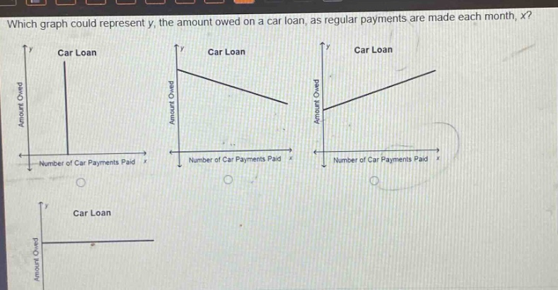
which graph could represent y, the amount owed on a car loan, as regular payments are made each month, x?\ncar loan\ncar loan\ncar loan\namount owed\namount owed\namount owed\nnumber of car payments paid\nnumber of car payments paid\nnumber of car payments paid\ncar loan\namount owed
Answer
Explanation:
Step1: Analyze the relationship
As regular payments are made each month ($x$ increases), the amount owed on the car - loan ($y$) decreases.
Step2: Evaluate the graphs
The first graph is a vertical line, which means $y$ does not change with $x$, so it is incorrect. The second graph shows a linear decrease in $y$ as $x$ increases, which is consistent with the situation of making regular payments on a car - loan. The third graph shows $y$ increasing as $x$ increases, which is incorrect. The fourth graph shows $y$ remaining constant as $x$ increases, which is also incorrect.
Answer:
The second graph (the one with a negative - slope line representing a decrease in the amount owed as the number of car payments paid increases).