which graph shows that ben earns $5 per hour?
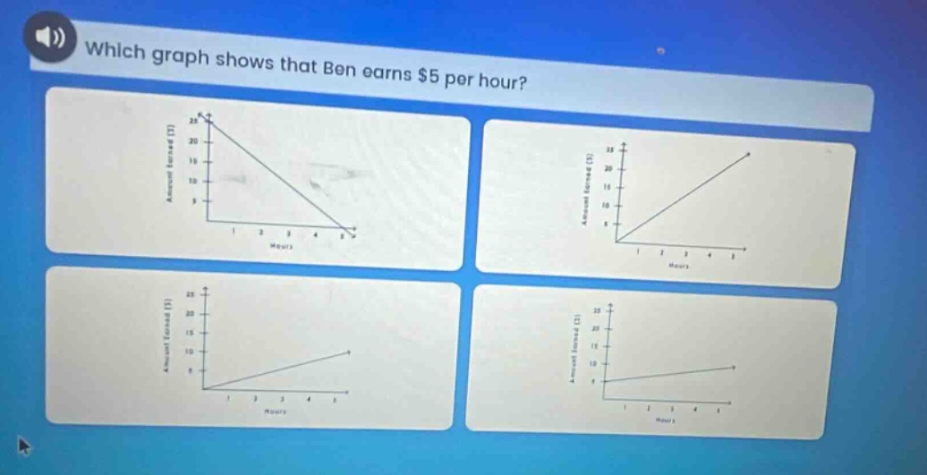
which graph shows that ben earns $5 per hour?
Answer
Explanation:
Step1: Recall slope - rate relationship
The rate of $5$ dollars per hour represents the slope of the linear relationship between the amount earned and the number of hours. The equation of the relationship is $y = 5x$, where $y$ is the amount earned and $x$ is the number of hours. The slope $m$ of a line in the form $y=mx + b$ (here $b = 0$) is the rate of change.
Step2: Analyze slope of each graph
For a line $y=mx$, when $m = 5$, it means for every increase of 1 in the $x$ - value (number of hours), the $y$ - value (amount earned) increases by 5. In a graph of $y$ vs $x$, the slope $m=\frac{\Delta y}{\Delta x}$. A slope of 5 means if we move 1 unit to the right along the $x$ - axis, we move 5 units up along the $y$ - axis.
Step3: Identify the correct graph
The graph with a slope of 5 will have points such as $(1,5)$, $(2,10)$, $(3,15)$ etc. Looking at the graphs, the graph where when $x = 1$, $y=5$; when $x = 2$, $y = 10$ and so on is the correct one. It is a straight - line passing through the origin $(0,0)$ with a positive slope.
Answer:
The graph with a straight - line passing through the origin and having a positive slope such that for every 1 unit increase in the number of hours (x - axis), the amount earned (y - axis) increases by 5 units. Without seeing the exact details of the graphs, it should be the graph where the ratio of the y - value to the x - value is 5 for non - zero x values.