the graph shows a demand curve with the price of a good compared to the quantity demanded. demand for…
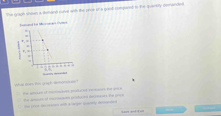
the graph shows a demand curve with the price of a good compared to the quantity demanded. demand for microwave ovens what does this graph demonstrate? the amount of microwaves produced increases the price the amount of microwaves produced decreases the price the price decreases with a larger quantity demanded
Answer
Brief Explanations:
In economics, the demand - curve shows an inverse relationship between price and quantity demanded. As the price of a good (microwave ovens here) increases, the quantity demanded decreases, and vice - versa. This is demonstrated by the downward - sloping demand curve in the graph.
Answer:
the price decreases with a larger quantity demanded