the graph shows the market for graphic t - shirts. what does the graph show about the relationship between a…
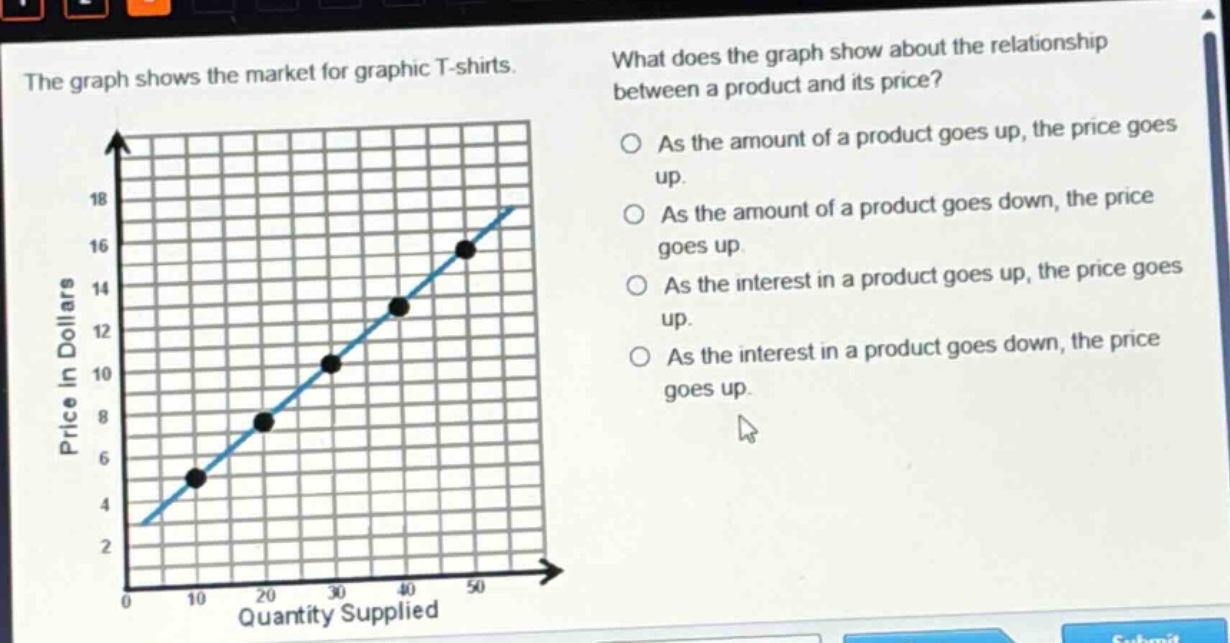
the graph shows the market for graphic t - shirts. what does the graph show about the relationship between a product and its price? as the amount of a product goes up, the price goes up. as the amount of a product goes down, the price goes up. as the interest in a product goes up, the price goes up. as the interest in a product goes down, the price goes up.
Answer
Brief Explanations:
The x - axis represents quantity supplied of graphic T - shirts and the y - axis represents price. As the quantity supplied (amount of the product) increases along the x - axis, the price on the y - axis also increases, showing a positive relationship between quantity supplied and price.
Answer:
As the amount of a product goes up, the price goes up.