the graph shows the price of a good compared to the quantity supplied. supply of cars this graph…
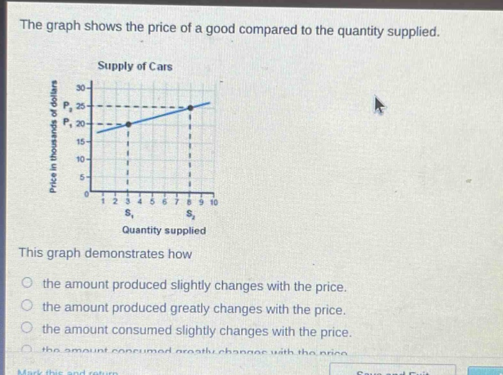
the graph shows the price of a good compared to the quantity supplied. supply of cars this graph demonstrates how the amount produced slightly changes with the price. the amount produced greatly changes with the price. the amount consumed slightly changes with the price. the amount consumed greatly changes with the price.
Answer
Brief Explanations:
The graph is a supply - curve for cars showing the relationship between price and quantity supplied. As the price increases from $P_1$ (20 thousand dollars) to $P_2$ (25 thousand dollars), the quantity supplied increases from $S_1$ to $S_2$. The change in quantity supplied is relatively small compared to the change in price, indicating that the amount produced slightly changes with the price.
Answer:
the amount produced slightly changes with the price.