the graph shows the price of a good compared to the quantity supplied.\nsupply of cars\nthis graph…
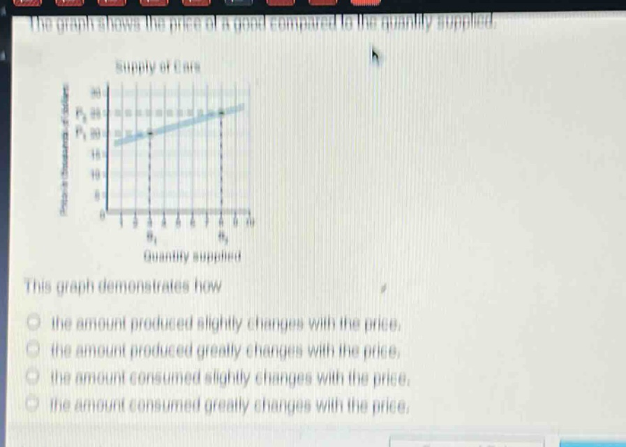
the graph shows the price of a good compared to the quantity supplied.\nsupply of cars\nthis graph demonstrates how\n- the amount produced slightly changes with the price.\n- the amount produced greatly changes with the price.\n- the amount consumed slightly changes with the price.\n- the amount consumed greatly changes with the price.
Answer
Brief Explanations:
The graph shows the supply of cars with price on the y - axis and quantity supplied on the x - axis. Supply represents the amount produced. The slope of the supply curve indicates that as the price changes, the quantity supplied changes slightly.
Answer:
the amount produced slightly changes with the price.