june has decided to take up quilting. she bought a sewing machine for $135. it costs her $11.75 in raw…
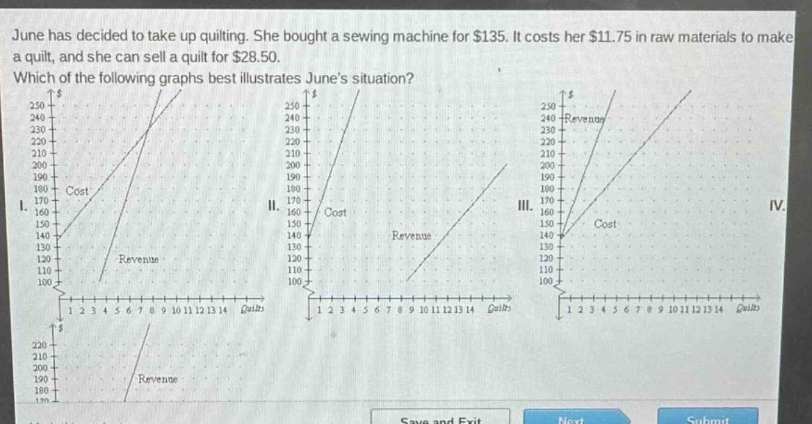
june has decided to take up quilting. she bought a sewing machine for $135. it costs her $11.75 in raw materials to make a quilt, and she can sell a quilt for $28.50. which of the following graphs best illustrates junes situation?
Answer
Explanation:
Step1: Define cost - function
The fixed cost of the sewing machine is $135$ and the variable cost per quilt is $11.75$. So the cost function $C(x)=135 + 11.75x$, where $x$ is the number of quilts. When $x = 0$, $C(0)=135$.
Step2: Define revenue - function
The selling price per quilt is $28.50$. So the revenue function $R(x)=28.5x$. When $x = 0$, $R(0)=0$.
Step3: Analyze the graphs
The cost - line should start at the point $(0,135)$ (because when no quilts are made, the cost is the cost of the sewing machine) and have a slope of $11.75$. The revenue - line should start at the origin $(0,0)$ and have a slope of $28.5$.
Answer:
The graph that has a cost - line starting at $(0,135)$ and a revenue - line starting at $(0,0)$ with the appropriate slopes is the correct one. Without seeing the full - set of options clearly, but based on the analysis, the cost line should have a non - zero $y$ - intercept (equal to 135) and the revenue line should have a $y$ - intercept of 0.