look at the chart comparing the price of graphic t - shirts to the quantity supplied. this chart is an…
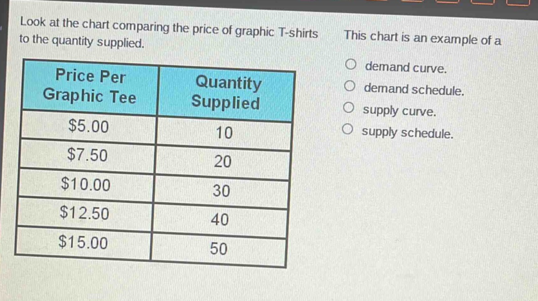
look at the chart comparing the price of graphic t - shirts to the quantity supplied. this chart is an example of a\nprice per graphic tee quantity supplied\n$5.00 10\n$7.50 20\n$10.00 30\n$12.50 40\n$15.00 50\no demand curve.\no demand schedule.\no supply curve.\no supply schedule.
Answer
Brief Explanations:
A supply schedule shows the relationship between the price of a good and the quantity supplied at various prices. The given chart lists different prices of graphic - T shirts and the corresponding quantity supplied, which is the characteristic of a supply schedule. A demand curve and demand schedule show the relationship between price and quantity demanded. A supply curve is a graphical representation of the supply schedule.
Answer:
supply schedule.