select the correct answer. which kind of graph is shown here? a. demand graph b. product graph c. supply graph
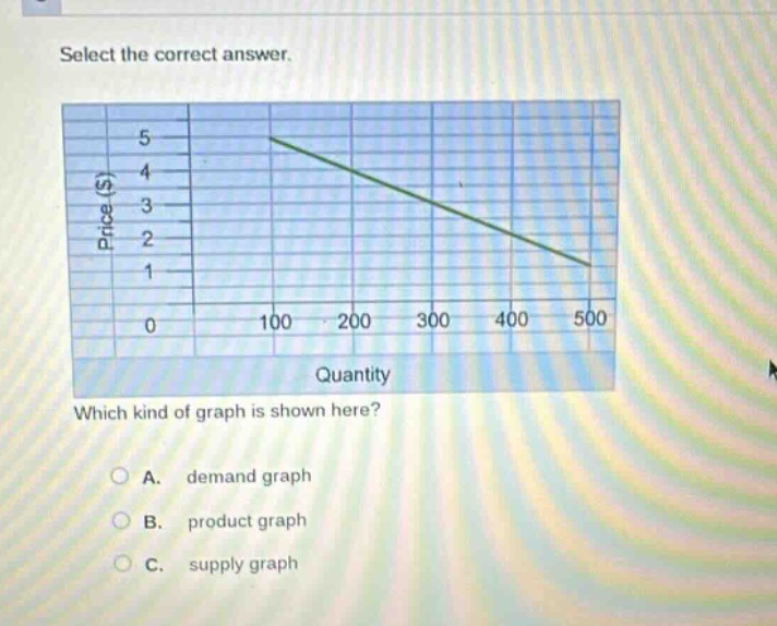
select the correct answer. which kind of graph is shown here? a. demand graph b. product graph c. supply graph
Answer
Answer:
A. demand graph
Brief Explanations:
The graph illustrates the relationship between the price of a good or service and the quantity demanded by consumers. The vertical axis represents Price ($), and the horizontal axis represents Quantity. The line slopes downward from left to right, indicating an inverse relationship: as the price decreases, the quantity demanded increases, and as the price increases, the quantity demanded decreases. This downward slope is the defining characteristic of a demand curve or demand graph in economics. A supply graph typically slopes upward, showing a positive relationship between price and quantity supplied. "Product graph" is not a standard term for this type of economic graph.