which statement is the most accurate explanation of the information on the graph?\nunemployment rates rise…
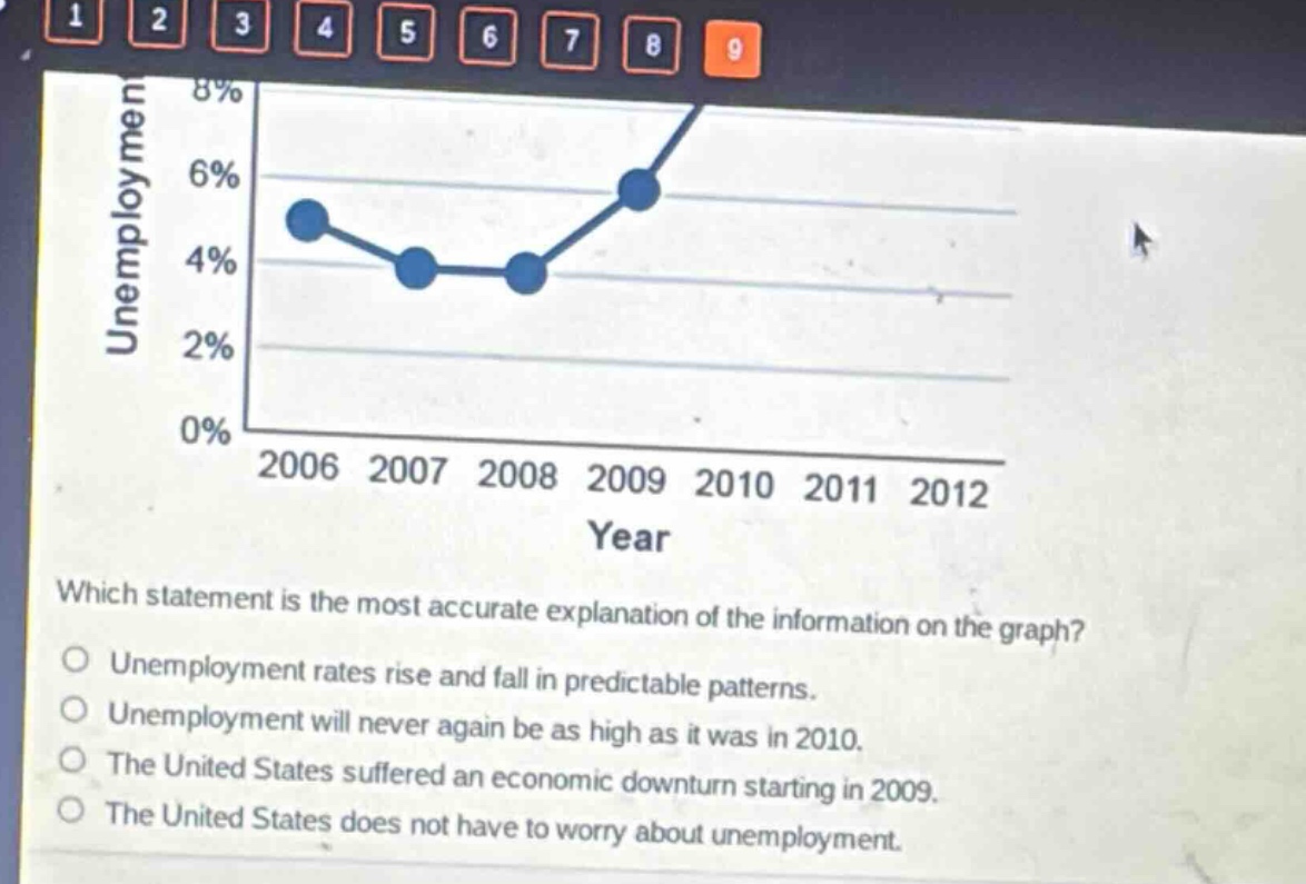
which statement is the most accurate explanation of the information on the graph?\nunemployment rates rise and fall in predictable patterns.\nunemployment will never again be as high as it was in 2010.\nthe united states suffered an economic downturn starting in 2009.\nthe united states does not have to worry about unemployment.
Answer
Brief Explanations:
The graph shows unemployment rates rising from 2009 - 2010. An economic downturn is often associated with rising unemployment. There's no indication of predictable patterns, no way to say unemployment won't reach 2010 levels again, and clearly the US has unemployment concerns.
Answer:
The United States suffered an economic downturn starting in 2009.