7. this graph shows waiting time at the doctors vs. patient happiness rate:\noutpatient satisfaction (likert…
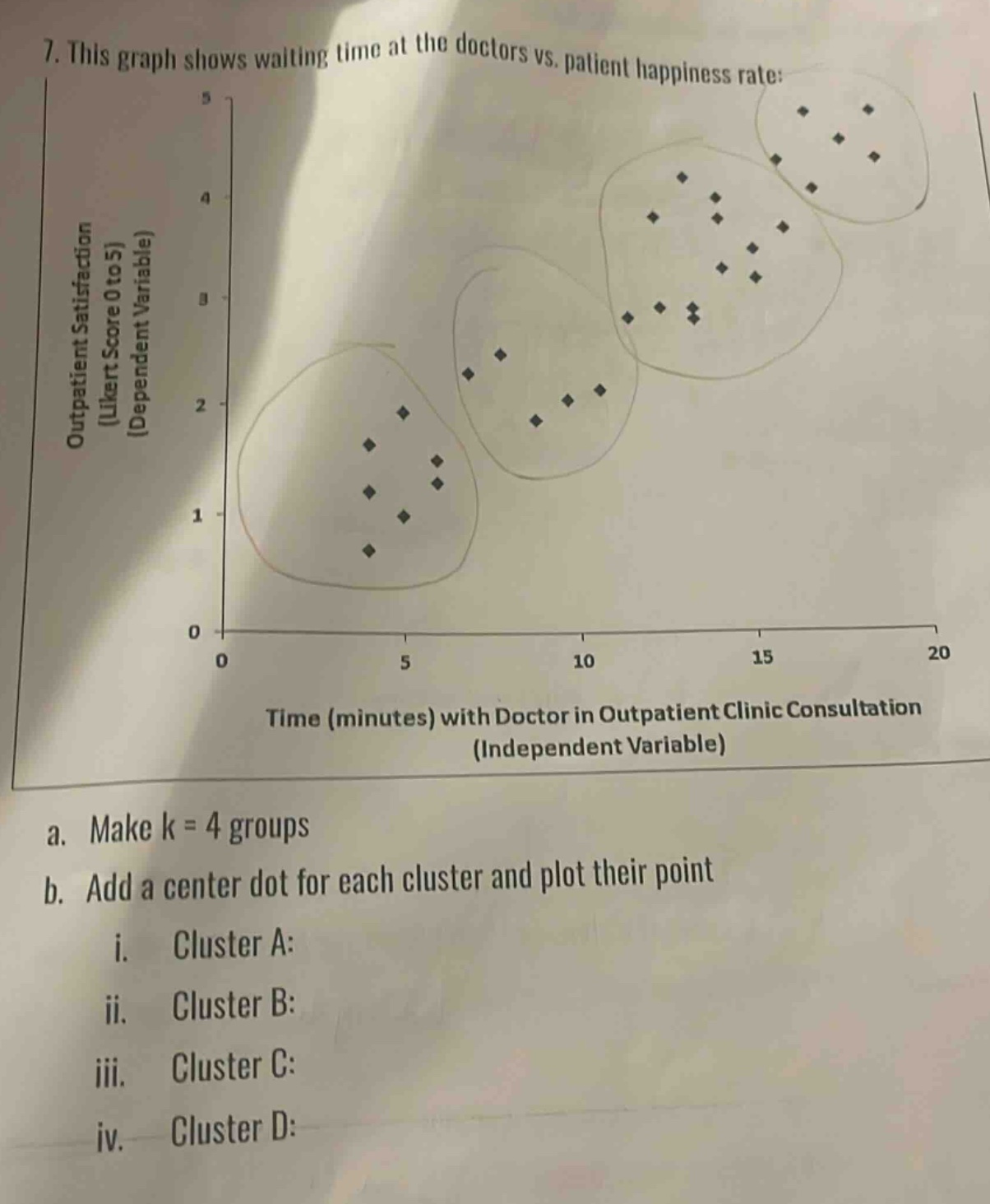
7. this graph shows waiting time at the doctors vs. patient happiness rate:\noutpatient satisfaction (likert score 0 to 5) (dependent variable)\ntime (minutes) with doctor in outpatient clinic consultation (independent variable)\na. make k = 4 groups\nb. add a center dot for each cluster and plot their point\n i. cluster a:\n ii. cluster b:\n iii. cluster c:\n iv. cluster d:
Answer
Explanation:
Step1: Identify existing clusters
Visually identify the 4 existing clusters in the scatter - plot.
Step2: Calculate cluster centers
For each cluster, find the mean of the x - coordinates (time with doctor) and the mean of the y - coordinates (outpatient satisfaction score) of the points in the cluster. Let the points in a cluster be ((x_1,y_1),(x_2,y_2),\cdots,(x_n,y_n)). The center of the cluster ((\bar{x},\bar{y})) is given by (\bar{x}=\frac{\sum_{i = 1}^{n}x_i}{n}) and (\bar{y}=\frac{\sum_{i = 1}^{n}y_i}{n}).
Step3: Plot cluster centers
Plot the calculated center points on the same graph.
Since we don't have the actual numerical data points, we can't give the exact coordinates of the centers. But the general process is as above.
Answer:
The centers of the clusters need to be calculated as described above and then plotted on the given scatter - plot. For example, if for Cluster A, after calculating the mean of x - values and y - values of its points, we get ((x_{A},\ y_{A})), for Cluster B ((x_{B},\ y_{B})), for Cluster C ((x_{C},\ y_{C})) and for Cluster D ((x_{D},\ y_{D})), we would plot these points on the graph.