QUESTION IMAGE
Question
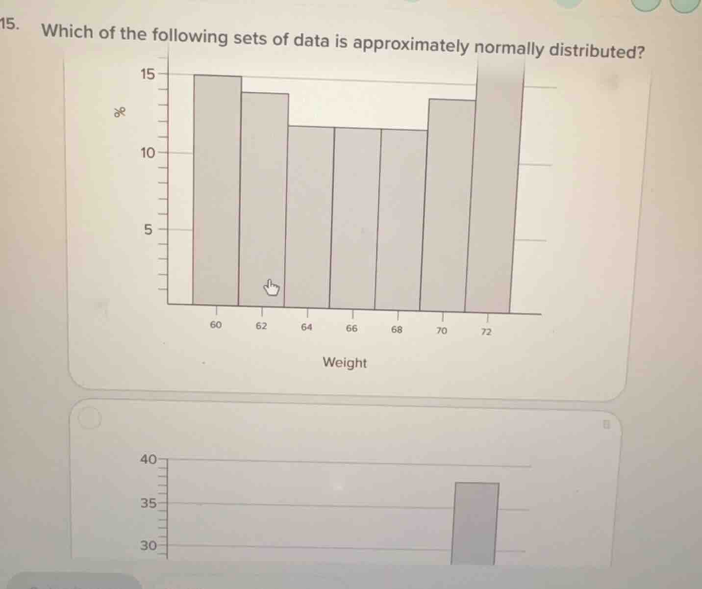
- which of the following sets of data is approximately normally distributed?
To determine which data set is approximately normally distributed, we analyze the shape of the histograms (even though the second histogram is partially visible, we focus on the first one provided):
Key Feature of Normal Distribution:
A normal distribution has a symmetric, bell - shaped curve (or histogram). This means the data is centered around a mean, with frequencies decreasing symmetrically as we move away from the mean (left and right tails are roughly equal in length, and the peak is in the middle).
Analyzing the First Histogram (Weight Data):
- The x - axis represents weight (60, 62, 64, 66, 68, 70, 72) and the y - axis represents percentage (frequency).
- The heights of the bars (frequencies) show a pattern that is roughly symmetric around the middle values (e.g., 66 - 68). The left side (around 60 - 64) and the right side (around 70 - 72) have frequencies that mirror each other in a way consistent with a bell - shape.
Analyzing the Second Histogram (Partially Visible):
The second histogram appears to have a single tall bar (likely a skewed or non - normal distribution, such as a right - skewed or left - skewed distribution, or a distribution with most data in one category), which does not match the symmetric, bell - shaped pattern of a normal distribution.
Thus, the data set represented by the first histogram (weight data with the symmetric, bell - shaped histogram) is approximately normally distributed.

Snap & solve any problem in the app
Get step-by-step solutions on Sovi AI
Photo-based solutions with guided steps
Explore more problems and detailed explanations
The data set represented by the first histogram (with weight on the x - axis and percentage on the y - axis, showing a symmetric, bell - shaped pattern) is approximately normally distributed.