QUESTION IMAGE
Question
- dok 2
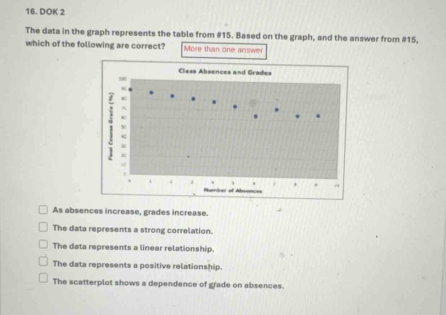
the data in the graph represents the table from #15. based on the graph, and the answer from #15, which of the following are correct?
more than one answer
class absences and grades
as absences increase, grades increase.
the data represents a strong correlation.
the data represents a linear relationship.
the data represents a positive relationship.
the scatterplot shows a dependence of grade on absences.
Brief Explanations
- Analyze "As absences increase, grades increase": From the scatter plot, as the number of absences (x - axis) increases, the final course grade (y - axis) decreases. So this statement is incorrect.
- Analyze "The data represents a strong correlation": The points in the scatter plot show a relatively clear downward trend, indicating a strong (negative) correlation. So this statement is correct.
- Analyze "The data represents a linear relationship": The points seem to follow a roughly straight - line (negative) pattern, so it represents a linear relationship. This statement is correct.
- Analyze "The data represents a positive relationship": A positive relationship would mean that as one variable increases, the other also increases. Here, as absences increase, grades decrease (negative relationship). So this statement is incorrect.
- Analyze "The scatterplot shows a dependence of grade on absences": Since the grade seems to change (decrease) as the number of absences changes, there is a dependence of grade on absences. This statement is correct.

Snap & solve any problem in the app
Get step-by-step solutions on Sovi AI
Photo-based solutions with guided steps
Explore more problems and detailed explanations
B. The data represents a strong correlation,
C. The data represents a linear relationship,
E. The scatterplot shows a dependence of grade on absences