QUESTION IMAGE
Question
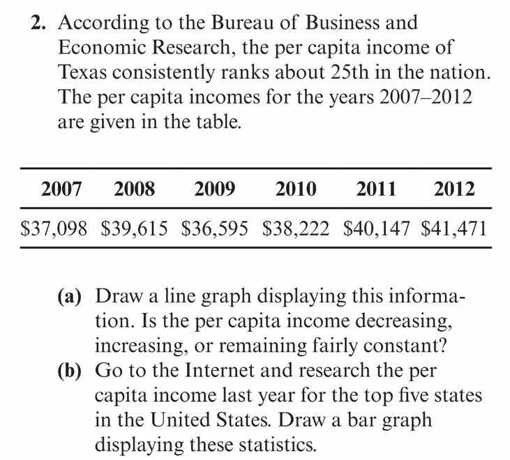
- according to the bureau of business and economic research, the per capita income of texas consistently ranks about 25th in the nation. the per capita incomes for the years 2007–2012 are given in the table.
| 2007 | 2008 | 2009 | 2010 | 2011 | 2012 |
|---|
(a) draw a line graph displaying this information. is the per capita income decreasing, increasing, or remaining fairly constant?
(b) go to the internet and research the per capita income last year for the top five states in the united states. draw a bar graph displaying these statistics.
Part (a)
Step 1: Prepare the data points
We have the years (2007 - 2012) on the x - axis and the per capita incomes (in dollars) on the y - axis. The data points are:
- (2007, 37098)
- (2008, 39615)
- (2009, 36595)
- (2010, 38222)
- (2011, 40147)
- (2012, 41471)
Step 2: Plot the points and draw the line graph
To draw the line graph:
- Label the x - axis as "Year" and mark the years 2007, 2008, 2009, 2010, 2011, 2012.
- Label the y - axis as "Per Capita Income (in dollars)" and choose an appropriate scale. For example, we can start from 35000 and go up to 42000 with an interval of 1000.
- Plot each of the data points (year, income) on the graph.
- Connect the points with straight line segments.
Step 3: Analyze the trend
Looking at the values:
- From 2007 ($37,098$) to 2008 ($39,615$), the income increases.
- From 2008 ($39,615$) to 2009 ($36,595$), the income decreases.
- From 2009 ($36,595$) to 2010 ($38,222$), the income increases.
- From 2010 ($38,222$) to 2011 ($40,147$), the income increases.
- From 2011 ($40,147$) to 2012 ($41,471$), the income increases.
Overall, despite a dip in 2009, the general trend from 2007 to 2012 is that the per capita income is increasing. The values in 2010, 2011, and 2012 are higher than the value in 2007, and the overall direction of the line (after the 2009 dip) is upward.
Part (b)
Step 1: Research the data
To complete this part, we need to go to a reliable source (such as the Bureau of Economic Analysis, Census Bureau, or other economic data websites) to find the per capita income of the top five states in the United States for the most recent year (let's assume we are using data from, say, 2023 for illustration purposes. The actual data will depend on the year of research).
Suppose after research, we find the following (hypothetical) data for the top five states (in terms of per capita income) in 2023:
| State | Per Capita Income (in dollars) |
|---|---|
| Massachusetts | 82,000 |
| New Jersey | 80,000 |
| Connecticut | 78,000 |
| California | 75,000 |
Step 2: Draw the bar graph
- Label the x - axis as "State" and list the top five states.
- Label the y - axis as "Per Capita Income (in dollars)" and choose an appropriate scale (e.g., from 0 to 90,000 with an interval of 10,000).
- For each state, draw a bar whose height corresponds to the per capita income of that state.

Snap & solve any problem in the app
Get step-by-step solutions on Sovi AI
Photo-based solutions with guided steps
Explore more problems and detailed explanations
s
(a) After drawing the line graph, we observe that the per capita income is generally increasing (with a dip in 2009, but overall, the values in later years are higher than in 2007).
(b) The bar graph will be drawn using the data obtained from the internet research (the specific appearance of the bar graph depends on the actual data collected).