QUESTION IMAGE
Question
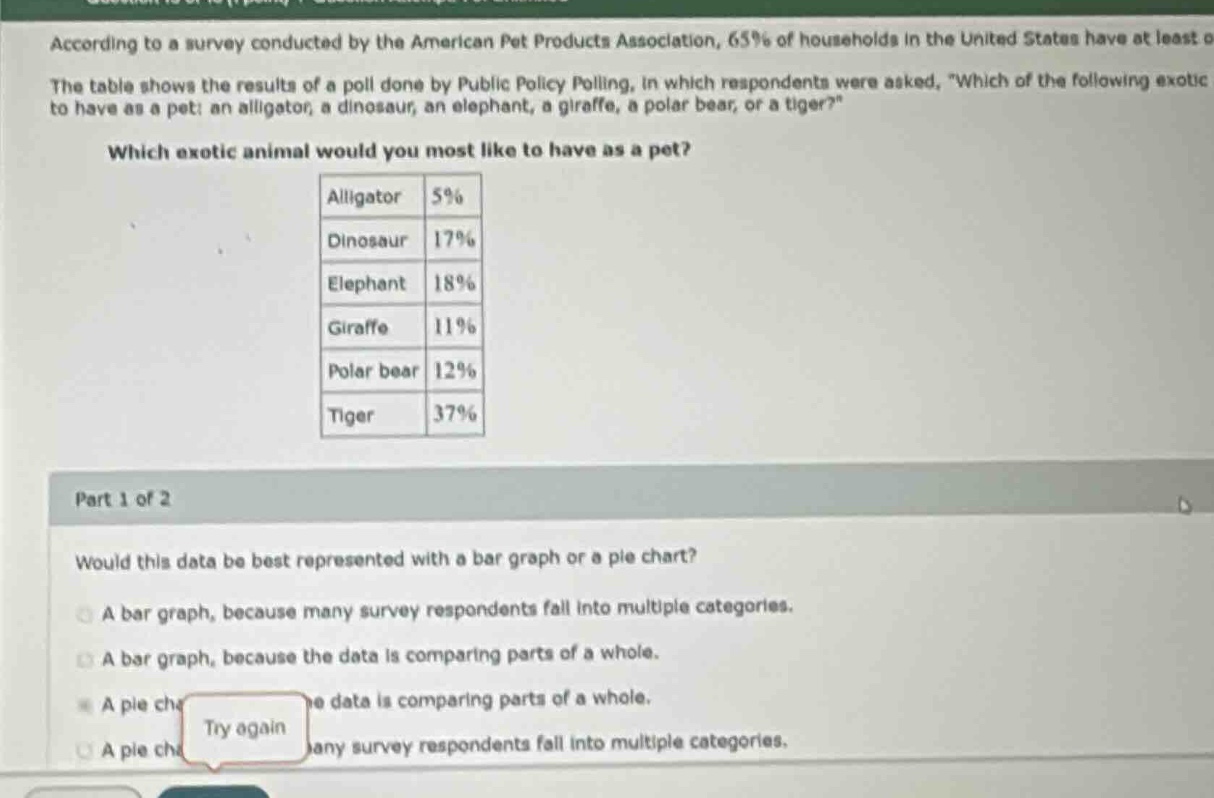
according to a survey conducted by the american pet products association, 65% of households in the united states have at least o the table shows the results of a poll done by public policy polling, in which respondents were asked, \which of the following exotic to have as a pet: an alligator, a dinosaur, an elephant, a giraffe, a polar bear, or a tiger?\ which exotic animal would you most like to have as a pet? alligator 5% dinosaur 17% elephant 18% giraffe 11% polar bear 12% tiger 37% part 1 of 2 would this data be best represented with a bar graph or a pie chart? a bar graph, because many survey respondents fall into multiple categories. a bar graph, because the data is comparing parts of a whole. a pie che data is comparing parts of a whole. a pie che any survey respondents fall into multiple categories. try again
To determine the best graph, we analyze the data and graph types:
- Pie Chart: Used for showing parts of a whole (percentages sum to 100% here, as each respondent likely chose one animal).
- Bar Graph: Used for comparing distinct categories, not for showing a whole.
- Eliminate options about "multiple categories" (respondents choose one animal, so no overlap).
- The data is percentages of a whole (all respondents’ choices), so a pie chart is best for showing parts of a whole.

Snap & solve any problem in the app
Get step-by-step solutions on Sovi AI
Photo-based solutions with guided steps
Explore more problems and detailed explanations
A pie chart, because the data is comparing parts of a whole.