QUESTION IMAGE
Question
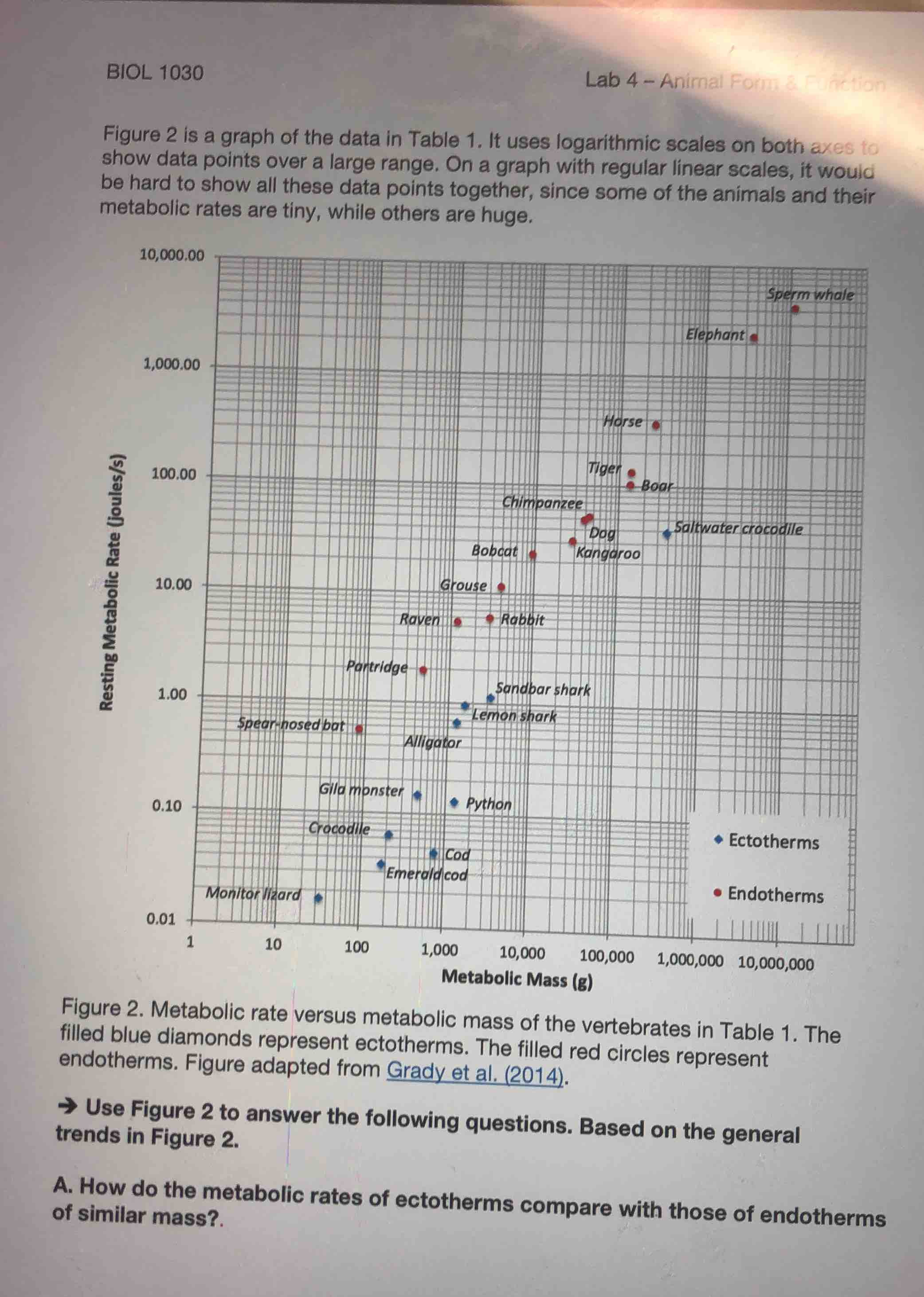
biol 1030 lab 4 – animal form & function figure 2 is a graph of the data in table 1. it uses logarithmic scales on both axes to show data points over a large range. on a graph with regular linear scales, it would be hard to show all these data points together, since some of the animals and their metabolic rates are tiny, while others are huge. figure 2. metabolic rate versus metabolic mass of the vertebrates in table 1. the filled blue diamonds represent ectotherms. the filled red circles represent endotherms. figure adapted from grady et al. (2014). → use figure 2 to answer the following questions. based on the general trends in figure 2. a. how do the metabolic rates of ectotherms compare with those of endotherms of similar mass?.
To answer this, we analyze the graph (Figure 2) where ectotherms are blue diamonds and endotherms are red circles. For animals with similar metabolic mass (x - axis), we compare their resting metabolic rates (y - axis). Looking at points of similar mass (e.g., around 100g or 1000g), the red circles (endotherms) are higher on the y - axis (higher metabolic rate) than the blue diamonds (ectotherms). So ectotherms have lower resting metabolic rates than endotherms of similar mass.

Snap & solve any problem in the app
Get step-by-step solutions on Sovi AI
Photo-based solutions with guided steps
Explore more problems and detailed explanations
Ectotherms have lower resting metabolic rates than endotherms of similar mass.