QUESTION IMAGE
Question
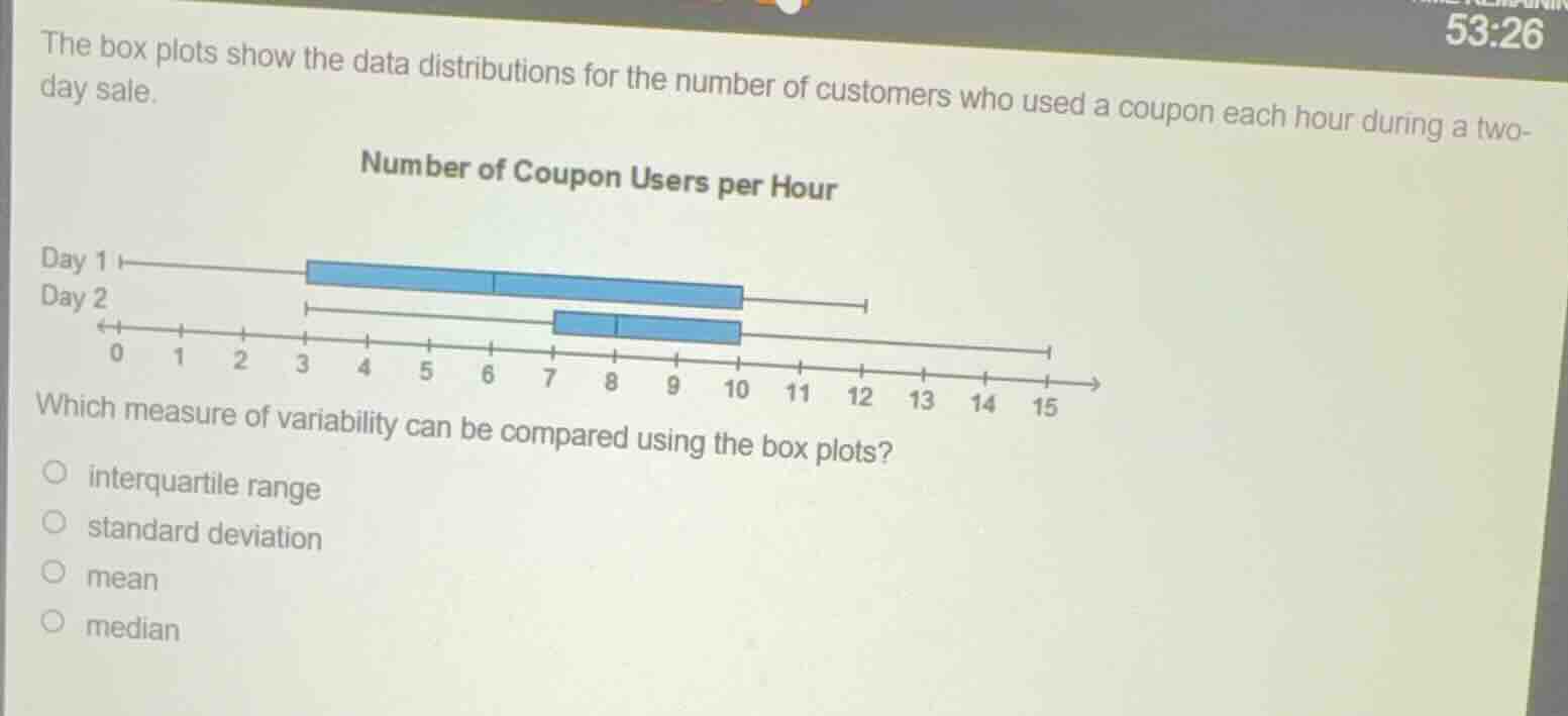
the box plots show the data distributions for the number of customers who used a coupon each hour during a two-day sale.
number of coupon users per hour
day 1
day 2
0 1 2 3 4 5 6 7 8 9 10 11 12 13 14 15
which measure of variability can be compared using the box plots?
interquartile range
standard deviation
mean
median
Brief Explanations
- Recall what box plots display: A box plot shows the minimum, first quartile (Q1), median (Q2), third quartile (Q3), and maximum. The interquartile range (IQR) is calculated as \( \text{IQR} = Q3 - Q1 \), which can be determined from the length of the box (since the box spans from Q1 to Q3).
- Analyze other options:
- Standard deviation: Box plots do not provide information about standard deviation directly, as standard deviation is a measure of spread based on the mean, and box plots focus on quartiles.
- Mean: Box plots do not show the mean; they show the median (a measure of center, not variability).
- Median: The median is a measure of central tendency, not variability.
- Conclusion: The interquartile range is a measure of variability that can be found from the box (Q3 - Q1) in a box plot, so it can be compared between the two box plots.

Snap & solve any problem in the app
Get step-by-step solutions on Sovi AI
Photo-based solutions with guided steps
Explore more problems and detailed explanations
interquartile range