QUESTION IMAGE
Question
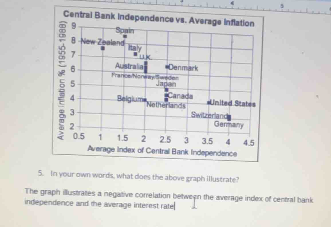
central bank independence vs. average inflation
average inflation % (1955 - 1988)
average index of central bank independence
- in your own words, what does the above graph illustrate?
the graph illustrates a negative correlation between the average index of central bank independence and the average interest rate
The graph is titled "Central Bank Independence vs. Average Inflation" with the x - axis as the average index of central bank independence and the y - axis as average inflation percentage (1955 - 1988). By observing the data points, as the average index of central bank independence (x - value) increases, the average inflation percentage (y - value) generally decreases. So it shows a negative correlation between the average index of central bank independence and average inflation (not interest rate as the original answer had a mistake).

Snap & solve any problem in the app
Get step-by-step solutions on Sovi AI
Photo-based solutions with guided steps
Explore more problems and detailed explanations
The graph illustrates a negative correlation between the average index of central bank independence and the average inflation percentage (for the period 1955 - 1988) across different countries. As the average index of central bank independence increases, the average inflation percentage generally decreases.