QUESTION IMAGE
Question
challenge activity 1.2.2 misleading graphs.
770466.5310272.qx3ny7
jump to level 1
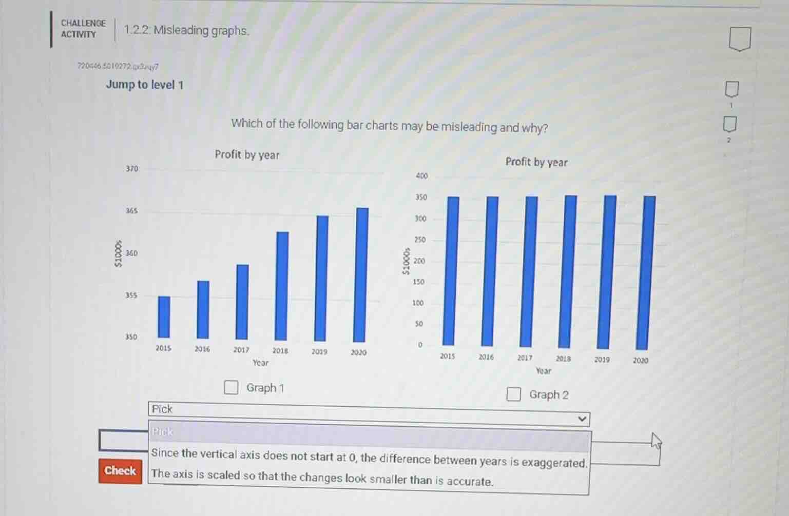
which of the following bar charts may be misleading and why?
profit by year
370
365
360
355
350
2015 2016 2017 2018 2019 2020
year
graph 1
profit by year
400
350
300
250
200
150
100
50
0
2015 2016 2017 2018 2019 2020
year
graph 2
pick
since the vertical axis does not start at 0, the difference between years is exaggerated.
the axis is scaled so that the changes look smaller than is accurate.
check
Graph 1 has a vertical axis that starts at 350 (not 0), which visually inflates the apparent difference in profits between each year. Graph 2 uses a vertical axis starting at 0, which presents the profit changes more accurately.

Snap & solve any problem in the app
Get step-by-step solutions on Sovi AI
Photo-based solutions with guided steps
Explore more problems and detailed explanations
Graph 1; Since the vertical axis does not start at 0, the difference between years is exaggerated.