QUESTION IMAGE
Question
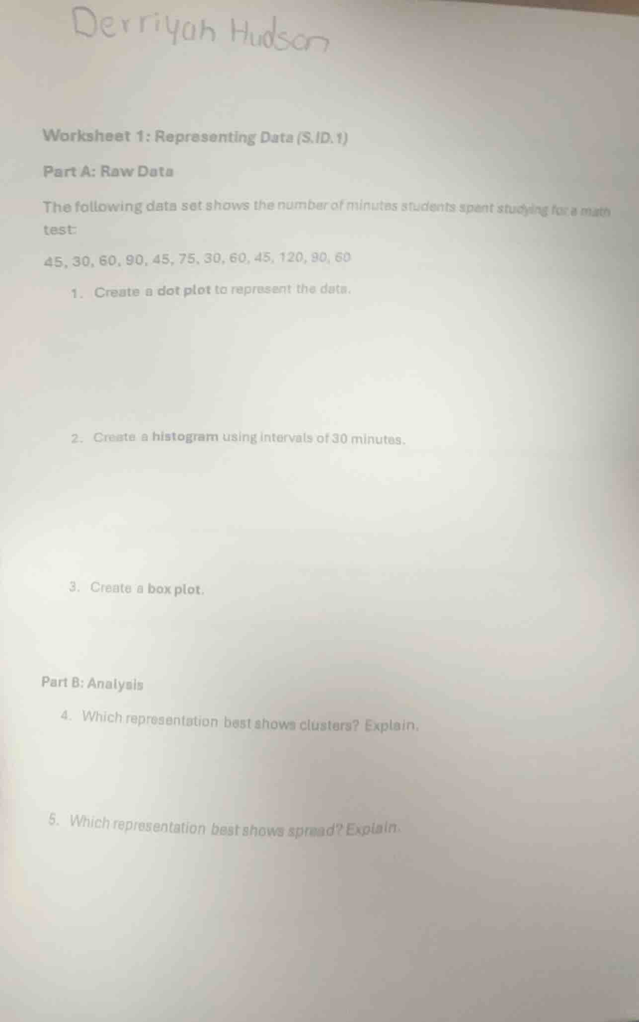
derriyah hudson
worksheet 1: representing data (s.id.1)
part a: raw data
the following data set shows the number of minutes students spent studying for a math
test:
45, 30, 60, 90, 45, 75, 30, 60, 45, 120, 90, 60
- create a dot plot to represent the data.
- create a histogram using intervals of 30 minutes.
- create a box plot.
part b: analysis
- which representation best shows clusters? explain.
- which representation best shows spread? explain.
Step1: Organize data by frequency
First, sort and count occurrences of each value:
30: 2, 45: 3, 60: 3, 75:1, 90:2, 120:1
---
1. Dot Plot Creation
Step1: Label axis with values
Mark x-axis with the unique study times: 30, 45, 60, 75, 90, 120
Step2: Plot dots for each occurrence
- 30: ● ●
- 45: ● ● ●
- 60: ● ● ●
- 75: ●
- 90: ● ●
- 120: ●
---
2. Histogram Creation
Step1: Define 30-minute intervals
Intervals: 0-30, 31-60, 61-90, 91-120
Step2: Count data per interval
- 0-30: 2 (values: 30,30)
- 31-60: 8 (values: 45,45,45,60,60,60)
- 61-90: 3 (values:75,90,90)
- 91-120:1 (value:120)
Step3: Draw histogram bars
- x-axis: intervals; y-axis: frequency
- Bar 0-30: height=2
- Bar 31-60: height=8
- Bar 61-90: height=3
- Bar 91-120: height=1
---
3. Box Plot Creation
Step1: Sort the full data set
Sorted data: $30, 30, 45, 45, 45, 60, 60, 60, 75, 90, 90, 120$
Step2: Calculate 5-number summary
- Minimum: $30$
- Q1 (25th percentile): $\frac{45+45}{2}=45$
- Median (50th percentile): $\frac{60+60}{2}=60$
- Q3 (75th percentile): $\frac{75+90}{2}=82.5$
- Maximum: $120$
Step3: Draw box plot
- Draw a number line, mark the 5 summary values. Draw a box from Q1 to Q3, a line at the median, and whiskers from min to Q1, Q3 to max.
---
4. Cluster Representation Analysis
Step1: Identify best plot for clusters
Dot plots show individual data points grouped at specific values, making clusters visually clear.
Step2: Explain reasoning
Clusters are groups of similar values; the dot plot directly shows dense groupings at 45 and 60, which is easier to see than in a histogram or box plot.
---
5. Spread Representation Analysis
Step1: Identify best plot for spread
Box plots explicitly display the 5-number summary, which quantifies the full range and interquartile spread of the data.
Step2: Explain reasoning
The box plot's whiskers show the total spread (min to max), and the box shows the spread of the middle 50% of data, which is designed to highlight data dispersion more directly than the other plots.

Snap & solve any problem in the app
Get step-by-step solutions on Sovi AI
Photo-based solutions with guided steps
Explore more problems and detailed explanations
- Dot Plot:
    30: ● ●
    45: ● ● ●
    60: ● ● ●
    75: ●
    90: ● ●
120: ●- Histogram:
| Interval (Minutes) | Frequency |
|---|---|
| 31-60 | 8 |
| 61-90 | 3 |
| 91-120 | 1 |
(Bars are drawn with heights matching the frequencies above)
- Box Plot:
- Number line marked with: 30 (min), 45 (Q1), 60 (median), 82.5 (Q3), 120 (max)
- Box spanning 45 to 82.5, median line at 60, whiskers from 30 to 45 and 82.5 to 120
- The dot plot best shows clusters. It displays individual data points, so dense groupings (clusters) of values like 45 and 60 are immediately visible as groups of dots.
- The box plot best shows spread. It directly displays the minimum, maximum, and quartiles, which clearly quantify the total range of the data and the spread of the middle 50% of values.