QUESTION IMAGE
Question
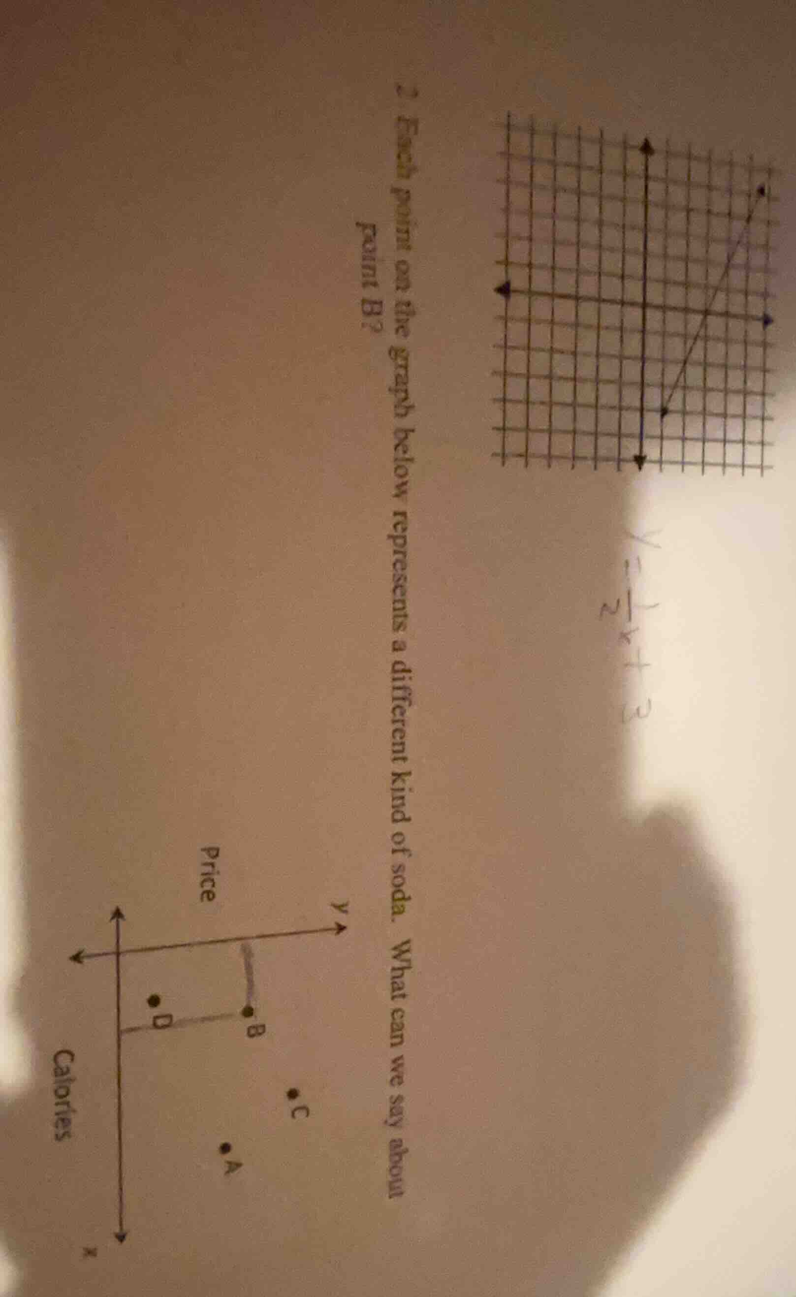
- each point on the graph below represents a different kind of soda. what can we say about point b?
Step1: Analyze the Axes
The x - axis is labeled "Calories" (representing the number of calories in the soda) and the y - axis is labeled "Price" (representing the price of the soda). Point B is plotted on the graph with a certain x (calories) and y (price) coordinate.
Step2: Compare with Other Points
Looking at the position of point B relative to other points (like D, A, C), we can see that for point B, when we consider the x - value (calories) and y - value (price), compared to point D (which has a lower x - value, i.e., fewer calories), point B has a higher y - value (higher price) and a higher x - value (more calories) than D. But in terms of the relationship between calories and price, point B, when compared to other points, likely has a relatively high price for its calorie content or we can observe that it has a certain combination of calories and price. From the graph, we can infer that point B has a higher price than some other points (like D) and a certain calorie count. But more precisely, when we look at the vertical (price) and horizontal (calories) distances, we can say that point B has a relatively high price and a moderate to high calorie count. However, the key observation is that among the points, point B has a higher price than point D (since D is to the left and below B in terms of the graph's axes, assuming standard graphing with x increasing to the right and y increasing upwards) and a higher calorie count than D. But the main thing we can say is that point B has a higher price than point D and a higher calorie count than D, or more generally, it represents a soda that has a certain price - calorie combination. But the most direct observation is that point B has a higher price than some other points (like D) and a corresponding calorie count. If we assume that the x - axis is calories (more to the right means more calories) and y - axis is price (more up means higher price), then point B has a higher price than point D (since D is below B on the y - axis) and more calories than D (since D is to the left of B on the x - axis). So we can say that the soda represented by point B has more calories and a higher price than the soda represented by point D. Or more simply, point B corresponds to a soda with a relatively high price and a certain amount of calories (more than some, less than others depending on other points). But the key takeaway is about the relationship between its price and calorie content.

Snap & solve any problem in the app
Get step-by-step solutions on Sovi AI
Photo-based solutions with guided steps
Explore more problems and detailed explanations
The soda represented by point B has a higher price and more calories than the soda represented by point D (or other relevant comparisons based on the graph's axis labels and point positions). (If we need a more specific answer, for example, if we consider the axes, point B has a higher price than point D and a higher calorie count than point D. So we can say that point B corresponds to a soda with more calories and a higher price than the soda at point D.)