QUESTION IMAGE
Question
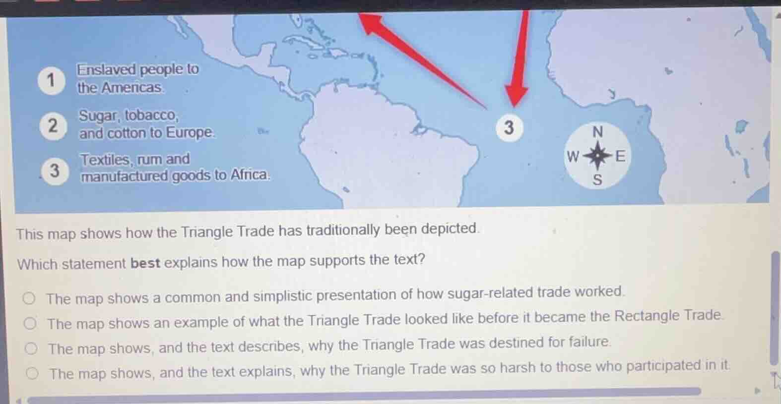
1 enslaved people to the americas. 2 sugar, tobacco, and cotton to europe. 3 textiles, rum and manufactured goods to africa. this map shows how the triangle trade has traditionally been depicted. which statement best explains how the map supports the text? the map shows a common and simplistic presentation of how sugar - related trade worked. the map shows an example of what the triangle trade looked like before it became the rectangle trade. the map shows, and the text describes, why the triangle trade was destined for failure. the map shows, and the text explains, why the triangle trade was so harsh to those who participated in it.
- Analyze Option 1: The map depicts the Triangle Trade's basic flow (enslaved people to Americas, cash crops to Europe, manufactured goods to Africa), and sugar was a key crop in this trade. This option says it's a common, simplistic presentation of sugar - related trade (sugar is part of the trade shown), which fits as the map gives a straightforward view of the trade's components including sugar.
- Analyze Option 2: There's no information about the Triangle Trade becoming the Rectangle Trade, so this is incorrect.
- Analyze Option 3: The map and text don't show the Triangle Trade was destined for failure; they show the trade's structure, so this is wrong.
- Analyze Option 4: The map doesn't show why the trade was harsh (it shows the flow of goods/people, not the harshness details), so this is incorrect.

Snap & solve any problem in the app
Get step-by-step solutions on Sovi AI
Photo-based solutions with guided steps
Explore more problems and detailed explanations
A. The map shows a common and simplistic presentation of how sugar - related trade worked.