QUESTION IMAGE
Question
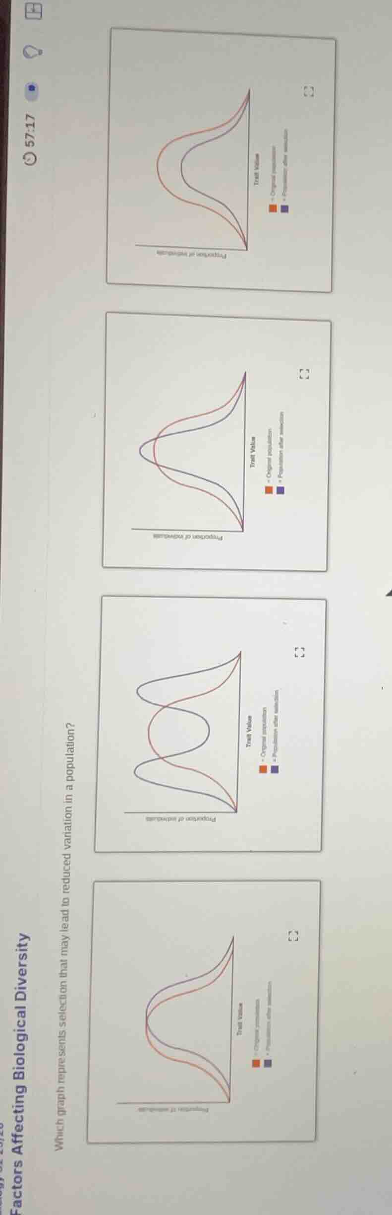
factors affecting biological diversity
which graph represents selection that may lead to reduced variation in a population?
To determine which graph represents selection leading to reduced variation, we analyze the concept of stabilizing selection (a type of natural selection that reduces variation by favoring intermediate phenotypes).
Key Concept:
Stabilizing selection narrows the range of phenotypic variation in a population. The original population has a broader distribution of traits; after selection, the curve becomes narrower (less spread out) around the mean, indicating reduced variation.
Analyzing the Graphs:
- Look for a graph where the “After Selection” curve is narrower than the “Original Population” curve (i.e., the spread of traits is reduced).
- Stabilizing selection eliminates extreme phenotypes, so the trait distribution becomes more concentrated around the mean.
For example, if one graph shows the original population with a wide curve and the post - selection curve as a narrower version of it (still centered on the same mean, just less spread out), that graph represents reduced variation from selection.
(Note: Since the exact graph labels/visuals aren’t fully clear, the logic is: identify the graph where the “After Selection” curve is narrower than the “Original Population” curve, consistent with stabilizing selection reducing phenotypic variation.)
If we assume the first graph (top - most) has the “After Selection” curve narrower than the original (e.g., the red and blue curves for after selection are closer together and narrower than the original), then that would be the answer. But generally, the graph with the post - selection curve having less spread (narrower) than the original represents reduced variation from selection.
Let's say the correct graph is the first one (top - most) among the given four.

Snap & solve any problem in the app
Get step-by-step solutions on Sovi AI
Photo-based solutions with guided steps
Explore more problems and detailed explanations
The top - most graph (the first one in the vertical arrangement) represents selection that may lead to reduced variation in a population. (If specific options were labeled, e.g., A, B, C, D, we would identify the correct labeled option based on the above logic.)