QUESTION IMAGE
Question
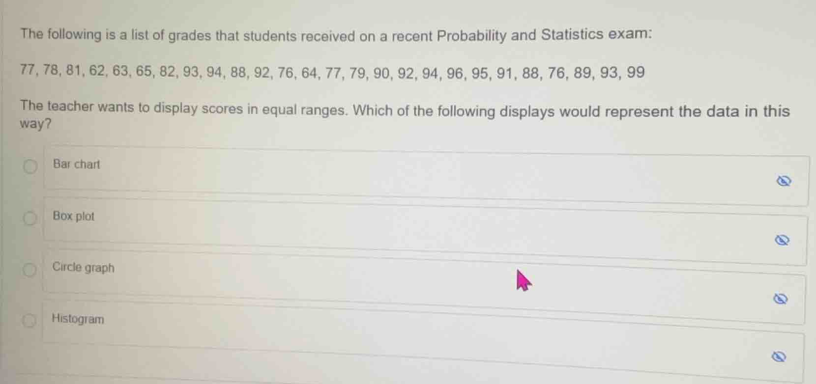
the following is a list of grades that students received on a recent probability and statistics exam:
77, 78, 81, 62, 63, 65, 82, 93, 94, 88, 92, 76, 64, 77, 79, 90, 92, 94, 96, 95, 91, 88, 76, 89, 93, 99
the teacher wants to display scores in equal ranges. which of the following displays would represent the data in this way?
bar chart
box plot
circle graph
histogram
A bar chart compares discrete categories, a box plot shows distribution quartiles, a circle graph displays proportions of a whole. A histogram specifically groups continuous numerical data (like exam scores) into equal ranges (bins) and plots the frequency of each range, which matches the teacher's need.

Snap & solve any problem in the app
Get step-by-step solutions on Sovi AI
Photo-based solutions with guided steps
Explore more problems and detailed explanations
Histogram