QUESTION IMAGE
Question
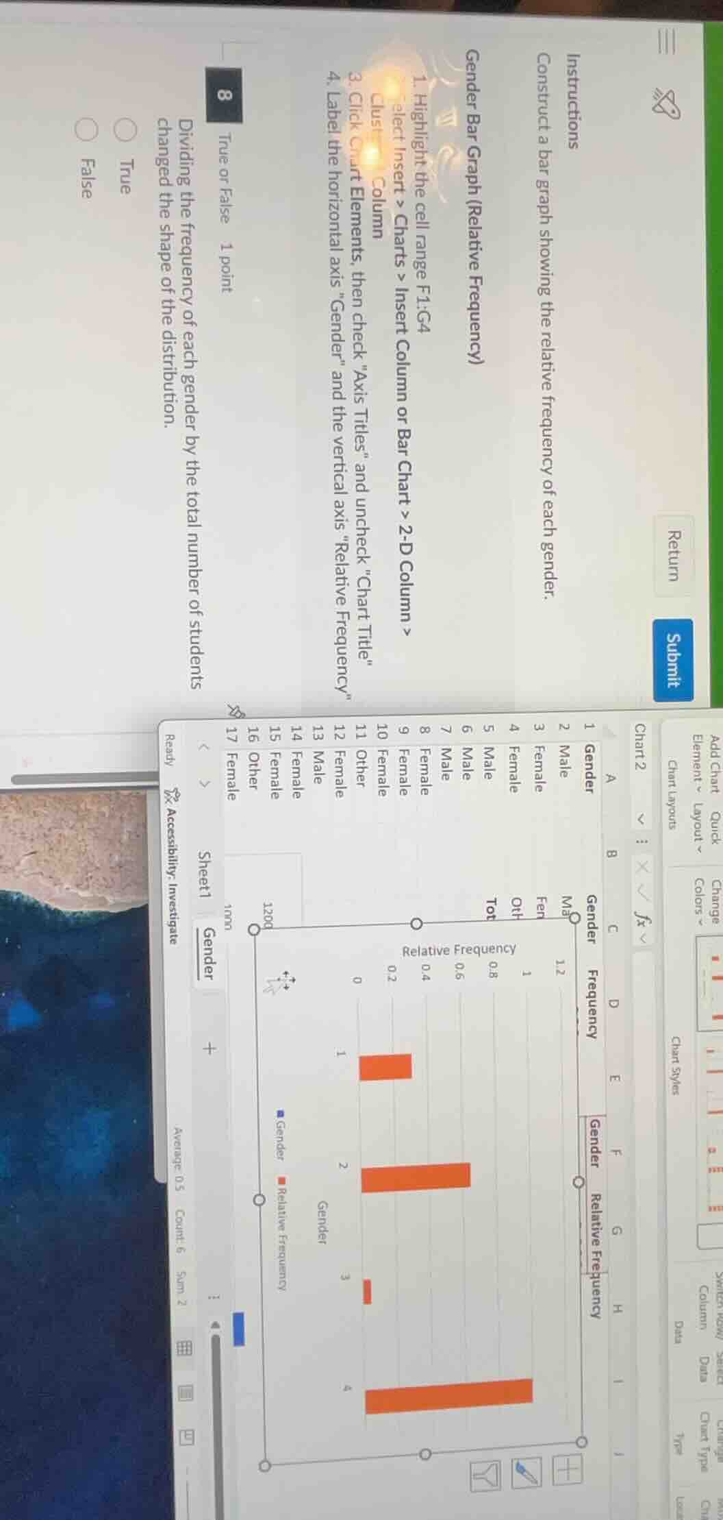
instructions
construct a bar graph showing the relative frequency of each gender.
gender bar graph (relative frequency)
- highlight the cell range f1:g4
- select insert > charts > insert column or bar chart > 2 - d column >
- cluster column
- click chart elements, then check \axis titles\ and uncheck \chart title\
- label the horizontal axis \gender\ and the vertical axis
elative frequency\
8
true or false 1 point
dividing the frequency of each gender by the total number of students changed the shape of the distribution.
true
false
Relative frequency is calculated by dividing each category's frequency by the total number of observations. This process scales the frequencies to a 0-1 range but preserves the proportional relationship between categories, so the shape of the distribution (the relative proportions of each gender) remains unchanged.

Snap & solve any problem in the app
Get step-by-step solutions on Sovi AI
Photo-based solutions with guided steps
Explore more problems and detailed explanations
False