QUESTION IMAGE
Question
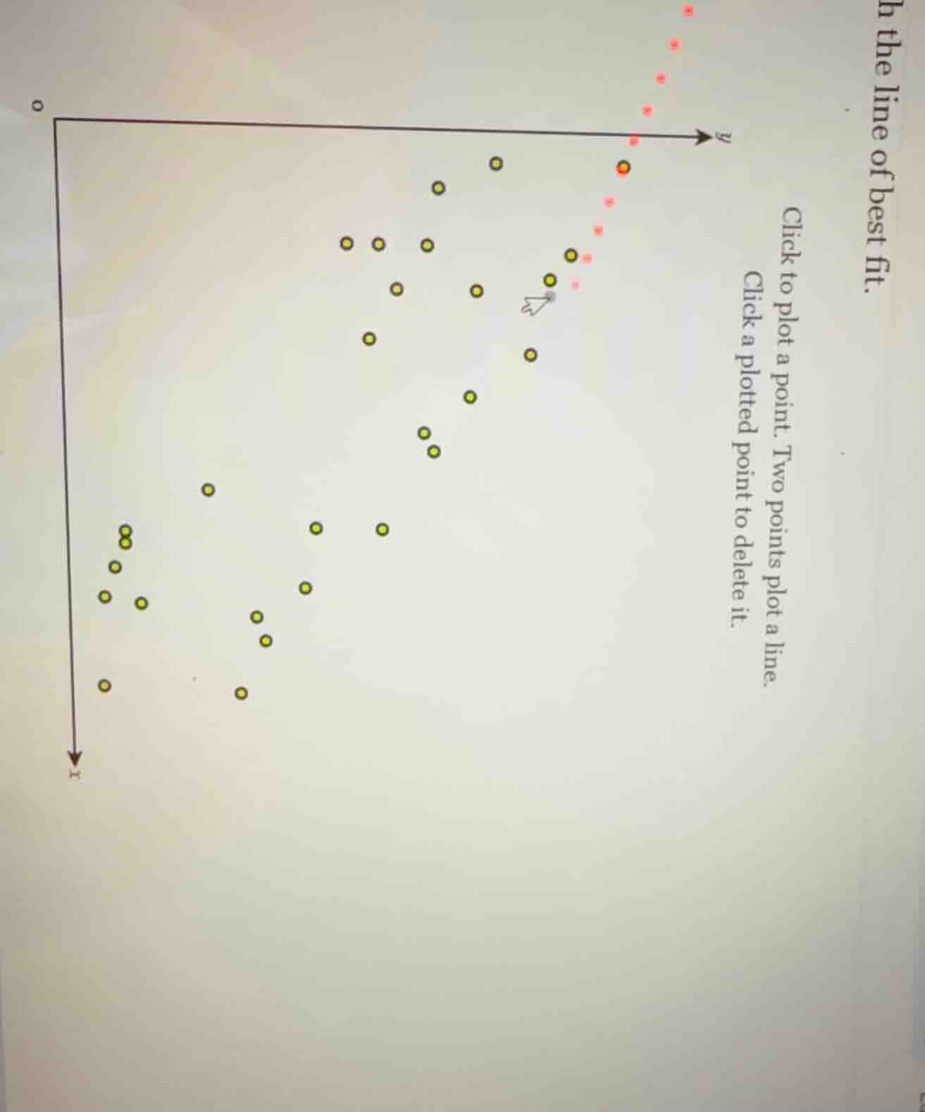
h the line of best fit.
click to plot a point. two points plot a line.
click a plotted point to delete it.
To determine the line of best fit for a scatter plot, we follow these general steps (though the specific implementation here is via a click - based interface):
Step 1: Identify the Trend
Observe the overall pattern of the yellow points. The points seem to have a negative correlation (as \(x\) increases, \(y\) tends to decrease) or positive? Wait, looking at the axes: the \(x\) - axis is going downwards (unconventional, but let's assume the bottom is higher \(x\) and top is lower \(x\)) and \(y\) - axis is to the right. Wait, maybe the standard is \(x\) horizontal (left - right) and \(y\) vertical (up - down), but here the \(x\) - axis is drawn with an arrow down, so maybe higher \(x\) is lower on the axis. The yellow points: as we move from lower \(x\) (top of \(x\) - axis) to higher \(x\) (bottom of \(x\) - axis), the \(y\) - values (right - left? No, \(y\) - axis is to the right, so higher \(y\) is more to the right) seem to decrease? Wait, no, the yellow points: the ones on the left (lower \(x\) if \(x\) is down) have lower \(y\) (more to the left) and the ones on the right (higher \(x\)) have higher \(y\)? Wait, maybe I got the axes wrong. Let's re - orient: usually, \(x\) is horizontal (left - right, increasing to the right) and \(y\) is vertical (up - down, increasing upwards). But in this plot, the \(x\) - axis arrow is down, so maybe \(x\) increases downwards, and \(y\) increases to the right. So the yellow points: as \(x\) (downwards) increases, \(y\) (to the right) increases? Wait, no, the left - most yellow points (top of \(x\) - axis, low \(x\)) have low \(y\) (left of \(y\) - axis), and the right - most yellow points (bottom of \(x\) - axis, high \(x\)) have high \(y\) (right of \(y\) - axis). So there is a positive correlation.
Step 2: Select Two Representative Points
We need to pick two points that lie close to the center of the cluster of yellow points, representing the trend. Let's assume we can identify two such points. For example, pick a point from the left - cluster and a point from the right - cluster that are on the general trend line.
Step 3: Plot the Line
In the given interface, we click on two such points to plot the line. Since this is a click - based task, we would visually estimate the line that best represents the trend of the yellow points (minimizing the overall distance from the points to the line) and then click on two points along that estimated line.
However, since this is a graphical interface task, the actual action is to visually inspect the scatter plot of yellow points, determine the general trend (positive or negative correlation, here it seems positive if we consider \(x\) increasing down and \(y\) increasing right), and then click on two points that lie on the line that best fits the distribution of the yellow points.
If we were to do this, we would:
- Look for the "center" of the scatter of yellow points.
- Choose two points that seem to be on the line that balances the number of points above and below it.
For example, if we take a left - side point (low \(x\), low \(y\)) and a right - side point (high \(x\), high \(y\)) that are in the middle of the cluster, clicking on those two points would draw the line of best fit.
(Note: Since this is a click - based interface, the final action is to click on two appropriate points on the scatter plot of yellow points to define the line of best fit. The exact points depend on the visual inspection of the plot, but the general method is to find the line that best represents the linear trend of the data points.)

Snap & solve any problem in the app
Get step-by-step solutions on Sovi AI
Photo-based solutions with guided steps
Explore more problems and detailed explanations
To determine the line of best fit for a scatter plot, we follow these general steps (though the specific implementation here is via a click - based interface):
Step 1: Identify the Trend
Observe the overall pattern of the yellow points. The points seem to have a negative correlation (as \(x\) increases, \(y\) tends to decrease) or positive? Wait, looking at the axes: the \(x\) - axis is going downwards (unconventional, but let's assume the bottom is higher \(x\) and top is lower \(x\)) and \(y\) - axis is to the right. Wait, maybe the standard is \(x\) horizontal (left - right) and \(y\) vertical (up - down), but here the \(x\) - axis is drawn with an arrow down, so maybe higher \(x\) is lower on the axis. The yellow points: as we move from lower \(x\) (top of \(x\) - axis) to higher \(x\) (bottom of \(x\) - axis), the \(y\) - values (right - left? No, \(y\) - axis is to the right, so higher \(y\) is more to the right) seem to decrease? Wait, no, the yellow points: the ones on the left (lower \(x\) if \(x\) is down) have lower \(y\) (more to the left) and the ones on the right (higher \(x\)) have higher \(y\)? Wait, maybe I got the axes wrong. Let's re - orient: usually, \(x\) is horizontal (left - right, increasing to the right) and \(y\) is vertical (up - down, increasing upwards). But in this plot, the \(x\) - axis arrow is down, so maybe \(x\) increases downwards, and \(y\) increases to the right. So the yellow points: as \(x\) (downwards) increases, \(y\) (to the right) increases? Wait, no, the left - most yellow points (top of \(x\) - axis, low \(x\)) have low \(y\) (left of \(y\) - axis), and the right - most yellow points (bottom of \(x\) - axis, high \(x\)) have high \(y\) (right of \(y\) - axis). So there is a positive correlation.
Step 2: Select Two Representative Points
We need to pick two points that lie close to the center of the cluster of yellow points, representing the trend. Let's assume we can identify two such points. For example, pick a point from the left - cluster and a point from the right - cluster that are on the general trend line.
Step 3: Plot the Line
In the given interface, we click on two such points to plot the line. Since this is a click - based task, we would visually estimate the line that best represents the trend of the yellow points (minimizing the overall distance from the points to the line) and then click on two points along that estimated line.
However, since this is a graphical interface task, the actual action is to visually inspect the scatter plot of yellow points, determine the general trend (positive or negative correlation, here it seems positive if we consider \(x\) increasing down and \(y\) increasing right), and then click on two points that lie on the line that best fits the distribution of the yellow points.
If we were to do this, we would:
- Look for the "center" of the scatter of yellow points.
- Choose two points that seem to be on the line that balances the number of points above and below it.
For example, if we take a left - side point (low \(x\), low \(y\)) and a right - side point (high \(x\), high \(y\)) that are in the middle of the cluster, clicking on those two points would draw the line of best fit.
(Note: Since this is a click - based interface, the final action is to click on two appropriate points on the scatter plot of yellow points to define the line of best fit. The exact points depend on the visual inspection of the plot, but the general method is to find the line that best represents the linear trend of the data points.)