QUESTION IMAGE
Question
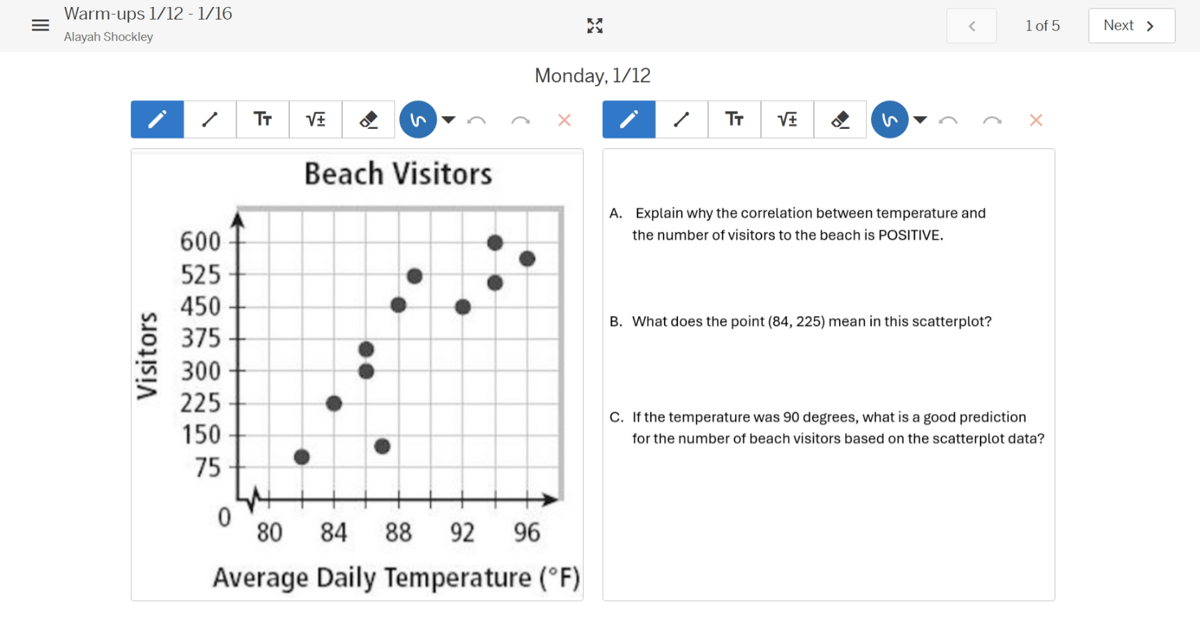
monday, 1/12
beach visitors
a. explain why the correlation between temperature and the number of visitors to the beach is positive.
b. what does the point (84, 225) mean in this scatterplot?
c. if the temperature was 90 degrees, what is a good prediction for the number of beach visitors based on the scatterplot data?
Part A
As temperature (x - variable) increases, the number of beach visitors (y - variable) generally increases. In a scatterplot, a positive correlation occurs when as one variable increases, the other variable also tends to increase. Here, we observe that higher temperatures are associated with more visitors (the points trend upwards from left to right), so the correlation is positive.
In a scatterplot, each point \((x,y)\) represents the value of the independent variable (x, here average daily temperature) and the dependent variable (y, here number of visitors). For the point \((84,225)\), \(x = 84\) (average daily temperature in \(^{\circ}\)F) and \(y=225\) (number of visitors). So it means when the average daily temperature is 84 degrees Fahrenheit, the number of beach visitors is 225.
Step 1: Analyze the scatterplot trend
The scatterplot shows a positive linear trend. We can look at the general pattern of the points. As temperature increases, visitors increase. Let's look at the approximate relationship. For example, at 84 \(^{\circ}\)F, visitors are 225; at 88 \(^{\circ}\)F, visitors are around 450; at 92 \(^{\circ}\)F, around 450 - 600, etc. We can also consider the line of best fit (visually).
Step 2: Predict for 90 \(^{\circ}\)F
90 is between 88 and 92. At 88 \(^{\circ}\)F, visitors are around 450; at 92 \(^{\circ}\)F, around 450 - 600. Averaging or looking at the trend, a good prediction could be around 500 (or a value between 450 and 600, but a more precise estimate: looking at the points, the trend is increasing. From 88 (450) to 92 (let's say 500 - 600), the increase per degree: from 88 to 92 is 4 degrees, and from 450 to 600 is 150 visitors, so about 37.5 visitors per degree. At 90 (2 degrees above 88), 450+2*37.5 = 525? Wait, no, maybe better to look at the visual. The points at 90 (mid - way between 88 and 92) – looking at the plot, the points around 90 would be around 500 - 550. Alternatively, since the points at 88 are ~450, at 92 ~500 - 600, so 90 is 2 degrees above 88, so a reasonable prediction is around 500 (or 525, but let's check the plot again. The point at 88 is 450, at 90 (between 88 and 92), the next points are 450, 525, 600. So a good prediction is around 500 (or 525, but let's say 500 as a middle value).

Snap & solve any problem in the app
Get step-by-step solutions on Sovi AI
Photo-based solutions with guided steps
Explore more problems and detailed explanations
As temperature increases, the number of beach visitors generally increases (points trend up left - to - right), so the correlation is positive.