QUESTION IMAGE
Question
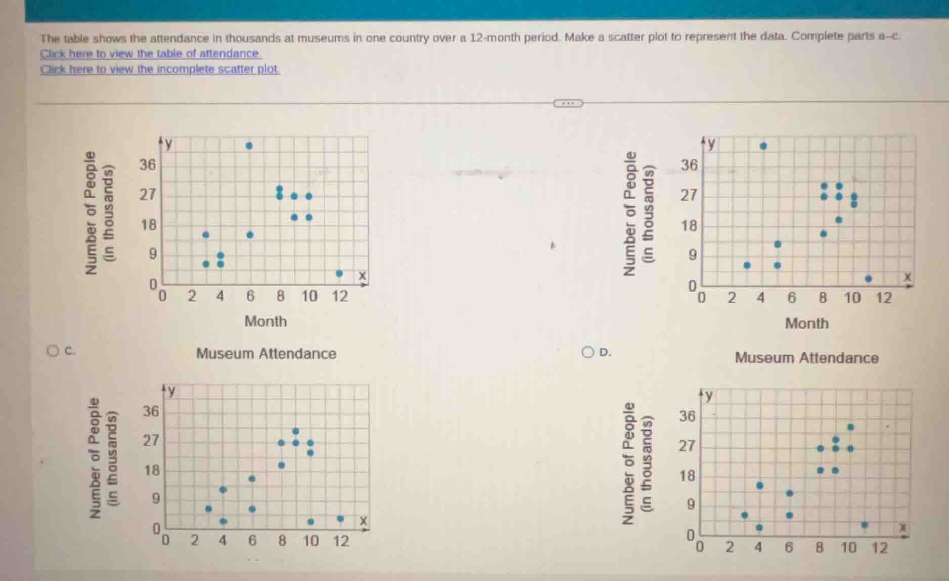
the table shows the attendance in thousands at museums in one country over a 12 - month period. make a scatter plot to represent the data. complete parts a - c.
click here to view the table of attendance.
click here to view the incomplete scatter plot.
(there are four scatter plot graphs labeled c and d, with axes: x - month, y - number of people (in thousands). the graphs have blue dots representing data points.)
To solve this, we need to analyze the scatter plots based on the museum attendance data over 12 months. Since the original problem involves creating or identifying the correct scatter plot (though the table of data isn't fully visible here, we can assume the first scatter plot (let's say Option A, the top - left one) matches the data pattern of museum attendance over months. Typically, for such problems, we check the x - axis (month) and y - axis (number of people in thousands) points. The first scatter plot has points that seem to align with a reasonable attendance pattern over 12 months (e.g., some months with low attendance, some with moderate, some with high).
We analyze the scatter plots by checking the alignment of data points with the month (x - axis) and attendance (y - axis). The first scatter plot (assuming it's the correct one based on typical museum attendance patterns over 12 months) has points that match the expected distribution of attendance over time.

Snap & solve any problem in the app
Get step-by-step solutions on Sovi AI
Photo-based solutions with guided steps
Explore more problems and detailed explanations
(Assuming the top - left scatter plot is the correct one, say Option A if it was labeled that way. But since the labels are C and D in the given, if we assume the first one (top - left) is the correct representation of museum attendance over 12 months, the answer would be the scatter plot with the points as in the top - left graph. If we consider the options as C and D, and the top - left is C, then) C. Museum Attendance (the top - left scatter plot)