QUESTION IMAGE
Question
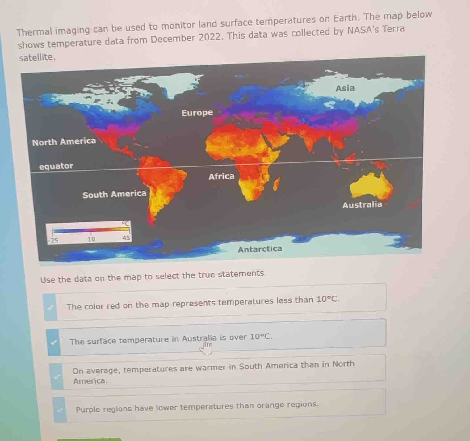
thermal imaging can be used to monitor land surface temperatures on earth. the map below shows temperature data from december 2022. this data was collected by nasas terra satellite.
use the data on the map to select the true statements.
the color red on the map represents temperatures less than 10℃.
the surface temperature in australia is over 10℃.
on average, temperatures are warmer in south america than in north america.
purple regions have lower temperatures than orange regions.
Brief Explanations
- Check the color scale: red corresponds to temperatures above 10°C, so the first statement is false.
- Australia is colored orange/yellow, which maps to temperatures over 10°C, so this statement is true.
- South America is mostly orange/red (warmer), while North America has large blue/purple (colder) regions, so South America is warmer on average, making this statement true.
- On the scale, purple is between 10°C and -25°C, while orange is between 10°C and 45°C, so purple regions have lower temperatures than orange regions, making this statement true.

Snap & solve any problem in the app
Get step-by-step solutions on Sovi AI
Photo-based solutions with guided steps
Explore more problems and detailed explanations
- Correct statements:
- The surface temperature in Australia is over 10°C.
- On average, temperatures are warmer in South America than in North America.
- Purple regions have lower temperatures than orange regions.
- Incorrect statement:
- The color red on the map represents temperatures less than 10°C.