QUESTION IMAGE
Question
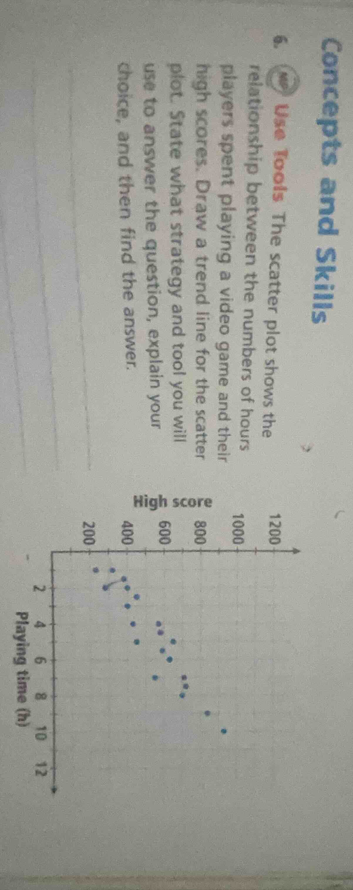
- use tools the scatter plot shows the relationship between the numbers of hours players spent playing a video game and their high scores. draw a trend line for the scatter plot. state what strategy and tool you will use to answer the question, explain your choice, and then find the answer.
Step1: Analyze the Scatter Plot
The scatter plot has playing time (in hours) on the y - axis and high score on the x - axis. We observe the general trend of the points. As playing time increases, the high scores also seem to increase.
Step2: Draw the Trend Line
To draw the trend line, we try to draw a line that best fits the data points. We can use a ruler to draw a line that passes through the middle of the cluster of points. The line should show the positive correlation between playing time and high score. For example, we can pick two points that seem to be on the trend, say (200, 2) and (1000, 10), and draw a line through them. The slope of the line $m=\frac{y_2 - y_1}{x_2 - x_1}=\frac{10 - 2}{1000 - 200}=\frac{8}{800}=0.01$. The equation of the line using point - slope form $y - y_1=m(x - x_1)$ with $(x_1,y_1)=(200,2)$ is $y - 2 = 0.01(x - 200)$, which simplifies to $y=0.01x$. This trend line shows that as playing time (x) increases, the high score (y) increases, indicating a positive linear relationship between the number of hours players spent playing a video game and their high scores.

Snap & solve any problem in the app
Get step-by-step solutions on Sovi AI
Photo-based solutions with guided steps
Explore more problems and detailed explanations
The trend line shows a positive linear relationship between playing time and high score. The strategy used is to analyze the scatter plot points, identify the general trend (positive correlation), and draw a line of best fit. The trend line can be represented by an equation like $y = 0.01x$ (approximate, depending on the points chosen for the line of best fit), indicating that as playing time increases, high scores tend to increase.