QUESTION IMAGE
Question
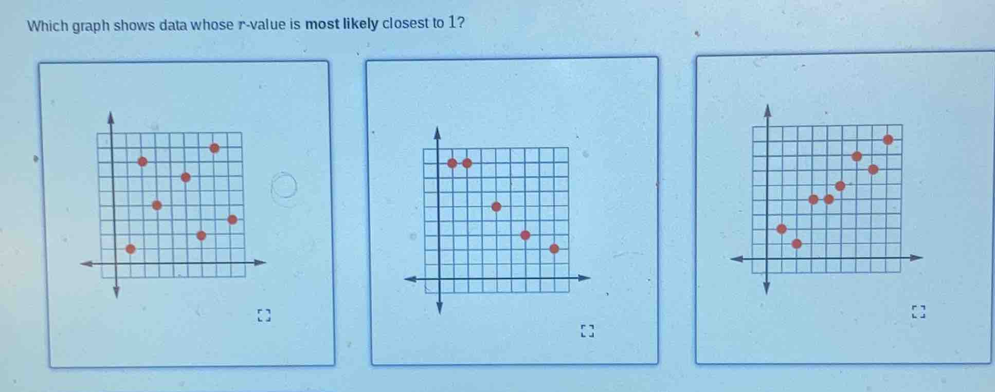
which graph shows data whose r - value is most likely closest to 1?
Step1: Recall r - value meaning
The correlation coefficient \( r \) measures the strength and direction of a linear relationship between two variables. An \( r \)-value close to 1 indicates a strong positive linear relationship, meaning as one variable increases, the other variable also increases, and the points lie close to a straight line with a positive slope.
Step2: Analyze each graph
- First graph: The points seem to have no clear linear trend (maybe scattered or a weak/non - linear trend).
- Second graph: The points show a negative trend (as \( x \) increases, \( y \) decreases), so \( r \) would be close to - 1, not 1.
- Third graph: The points show a positive trend, and they lie relatively close to a straight line with a positive slope. This indicates a strong positive linear relationship, so its \( r \)-value is closest to 1.

Snap & solve any problem in the app
Get step-by-step solutions on Sovi AI
Photo-based solutions with guided steps
Explore more problems and detailed explanations
The third graph (the one on the right) shows data whose \( r \)-value is most likely closest to 1.