QUESTION IMAGE
Question
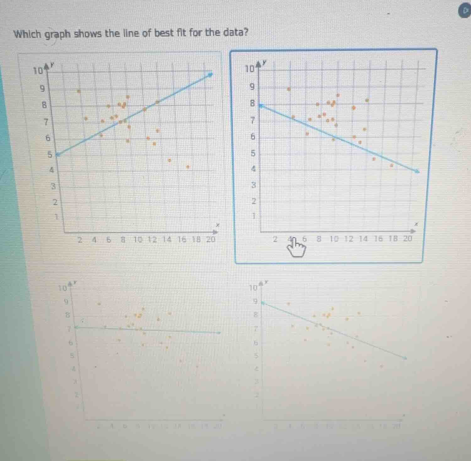
which graph shows the line of best fit for the data?
Step1: Identify data trend
Observe the scatter plot points: as $x$ increases, $y$ generally decreases, so the line has a negative slope.
Step2: Match slope to options
Eliminate the top-left graph (positive slope). Compare remaining negative slope graphs: the top-right graph's line aligns best with the overall downward trend of the data points, balancing the number of points above and below the line.

Snap & solve any problem in the app
Get step-by-step solutions on Sovi AI
Photo-based solutions with guided steps
Explore more problems and detailed explanations
The top-right graph (the one with a downward-sloping blue line starting at (0,8) and ending near (20,4)) is the correct line of best fit.