QUESTION IMAGE
Question
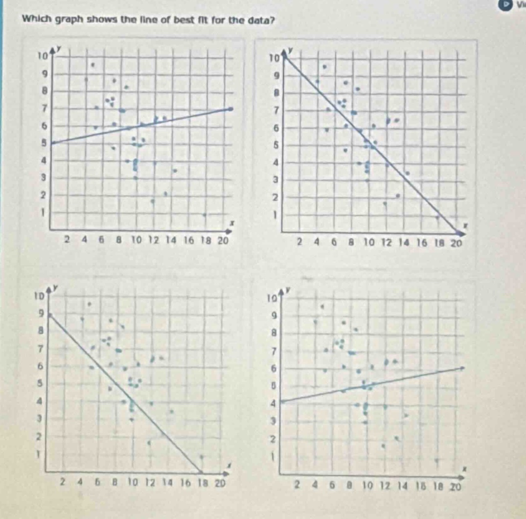
which graph shows the line of best fit for the data? (four graphs with scatter plots and lines are shown, x - axis from 2 to 20, y - axis from 1 to 10)
Response
To determine the line of best fit, we analyze the trend of the data points:
Step 1: Identify the Correlation
The data points generally show a positive correlation (as \( x \) increases, \( y \) tends to increase slightly). A positive correlation means the line of best fit should have a positive slope (rising from left to right).
Step 2: Evaluate Each Graph
- Top - Left Graph: The line has a positive slope, and the data points are reasonably distributed around it (consistent with a weak positive correlation).
- Top - Right Graph: The line has a negative slope (falling from left to right), which contradicts the positive trend of the data.
- Bottom - Left Graph: The line has a negative slope (falling from left to right), which contradicts the positive trend of the data.
- Bottom - Right Graph: The line’s slope is too shallow, and the vertical intercept (around \( y = 4 \)) does not align with the data’s vertical spread (points reach \( y = 10 \) and \( y = 1 \)).

Snap & solve any problem in the app
Get step-by-step solutions on Sovi AI
Photo-based solutions with guided steps
Explore more problems and detailed explanations
The top - left graph (with the positive - sloped line starting near \( (0, 5) \) and rising to \( (20, 7) \)) shows the line of best fit.