QUESTION IMAGE
Question
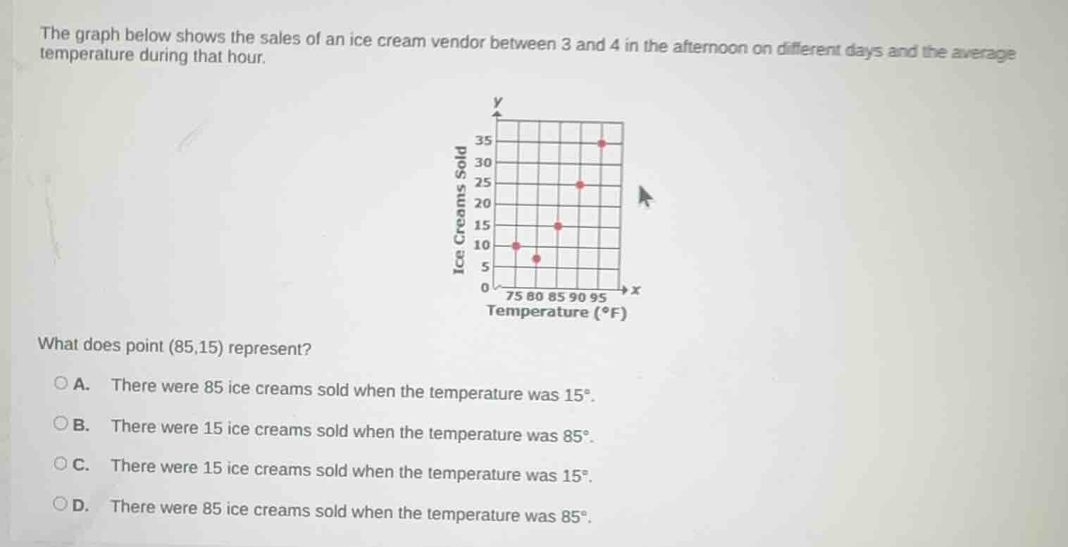
the graph below shows the sales of an ice cream vendor between 3 and 4 in the afternoon on different days and the average temperature during that hour.
chart: x-axis is temperature (°f) with labels 75,80,85,90,95; y-axis is ice creams sold with labels 0,5,10,15,20,25,30,35. points plotted at (75,10), (80,5), (85,15), (90,25), (95,35)
what does point (85,15) represent?
a. there were 85 ice creams sold when the temperature was 15°.
b. there were 15 ice creams sold when the temperature was 85°.
c. there were 15 ice creams sold when the temperature was 15°.
d. there were 85 ice creams sold when the temperature was 85°.
In a scatter plot, the x-axis corresponds to temperature (°F) and the y-axis corresponds to the number of ice creams sold. An ordered pair (x,y) means the x-value is the temperature, and the y-value is the number of ice creams sold at that temperature. For (85,15), x=85 (temperature) and y=15 (ice creams sold).

Snap & solve any problem in the app
Get step-by-step solutions on Sovi AI
Photo-based solutions with guided steps
Explore more problems and detailed explanations
B. There were 15 ice creams sold when the temperature was 85°.