QUESTION IMAGE
Question
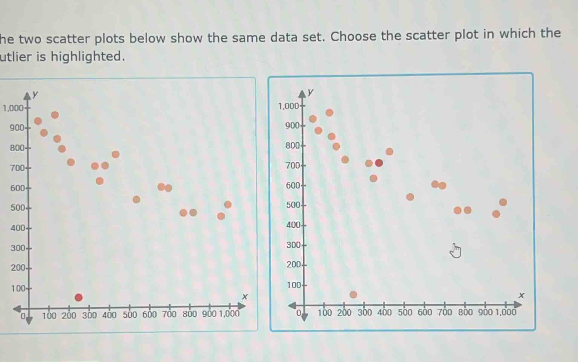
he two scatter plots below show the same data set. choose the scatter plot in which the utlier is highlighted.
Brief Explanations
An outlier is a data point that lies far outside the general cluster of other data points. In the left scatter plot, the red point at (200, ~50) is separated from all other points (which have y-values 400+), making it the true outlier. The right plot highlights a point within the main data cluster, which is not an outlier.

Snap & solve any problem in the app
Get step-by-step solutions on Sovi AI
Photo-based solutions with guided steps
Explore more problems and detailed explanations
The left scatter plot (with the red point near x=200, y=50) is the one where the outlier is correctly highlighted.