QUESTION IMAGE
Question
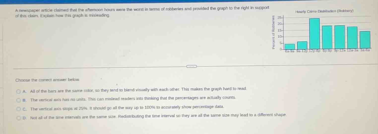
a newspaper article claimed that the afternoon hours were the worst in terms of robberies and provided the graph to the right in support of this claim. explain how this graph is misleading
choose the correct answer below.
a. all of the bars are the same color, so they tend to blend visually with each other. this makes the graph hard to read.
b. the vertical axis has no units. this can mislead readers into thinking that the percentages are actually counts.
c. the vertical axis stops at 25%. it should go all the way up to 100% to accurately show percentage data.
d. not all of the time intervals are the same size. redistributing the time interval so they are all the same size may lead to a different shape.
To determine why the graph is misleading, we analyze each option:
- Option A: Color blending doesn't directly mislead about the claim (afternoon worst for robberies), so A is incorrect.
- Option B: The vertical axis is labeled "Percent of Robberies", so units (percent) are implied, making B incorrect.
- Option C: Percentage data in a bar graph doesn't need to go to 100% if showing distribution of robberies across hours (each bar is a percentage of total robberies in that hour interval), so C is incorrect.
- Option D: The time intervals (e.g., 6a - 9a, 9a - 12p, 12p - 6p, etc.) have different durations (3 hours, 3 hours, 6 hours, etc.). When comparing "worst" (most robberies per hour or per interval), unequal intervals skew the visual. If intervals were equal (e.g., all 3 - hour intervals), the bar heights (percent of robberies in each interval) might change, altering the perception of which time is worst. This misleads the claim about afternoon hours.

Snap & solve any problem in the app
Get step-by-step solutions on Sovi AI
Photo-based solutions with guided steps
Explore more problems and detailed explanations
D. Not all of the time intervals are the same size. Redistributing the time interval so they are all the same size may lead to a different shape.